How to Create a Custom AMP Story for WordPress Using Photoshop, HTML, and CSS

Get helpful updates in your inbox
‘Stories’ have taken over as the preferred way for social media users to view, interact with, and share information. In 2018, TechCrunch published an article that stated Stories grew 15 times faster than feeds from Q2 2016 to Q3 2017.
The pioneer of the Story was Snapchat, which introduced Stories in October 2013. This was followed by Instagram releasing their version of Stories in August 2016, WhatsApp in February 2017, and Facebook Stories in March 2017. Now, companies like Medium, Skype, and YouTube have their own versions of Stories as well.
In February 2018, Google announced in their Developer’s blog that the newly-released custom AMP story is an “…addition to the AMP Project that provides content publishers with a mobile-focused format for delivering news and information as visually rich, tap-through stories.”
Are AMP stories going to show in search results?
AMP Stories works similarly to many other platforms’ stories, though focuses less on social and more on information. They are already appearing in some search results.
Since its release, publishers have used it to create Stories for their content, providing snippets of information in an easy, interactive way. Amongst some of these publishers are CNN and SB Nation, who use the Story format to provide quick but informative, visual-focused news.
The decline of the Stories trend is nowhere in sight and so it is important for publishers who want to stay relevant and reach a broader audience to understand how Stories work and possibly implement them into their publishing strategy.
How do you add an AMP story to a website?
Currently, there is an AMP Stories plugin for WordPress that makes it simple to drag and drop text boxes, upload pictures, designate transitions, and easily arrange elements on different pages of a story. While the plugin makes it simple to quickly create a story, it does limit the versatility of your story.
For those who like a little more creative freedom or control, the AMP stories plugin can be limiting. Luckily, with just a little HTML, CSS, and Photoshop knowledge, you can custom code your own AMP story by using code provided by Google AMP.
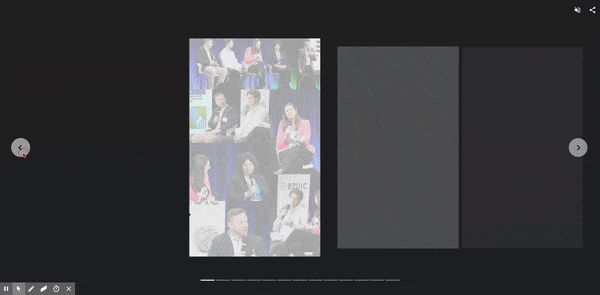
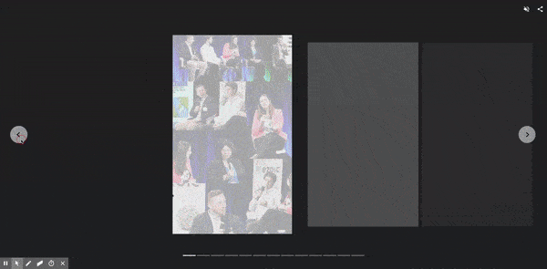
Below, I’m going to walk you through how I created different pages in Photoshop and custom-coded an AMP story for Ezoic about our Pubtelligence event in New York.
You can view the complete story here or watch the video below to see me go through my process step-by-step.
Where do I get the AMP Stories HTML and CSS?
I gathered some basic AMP story code from the AMP Stories website. There is a whole step-by-step process on the AMP Stories website that directs you to the code and files in a zip file.
The AMP Stories guide will also help you understand the pieces and steps of an AMP story by walking you through some of the code and visuals, element animation, and the different templates available, though I will be using some visuals from the guide here.
You will need a code editor program in order to change and test your AMP story before it goes live. I am most familiar with Komodo Edit, a free and open-source, multi-language code editor.

You can download it here, or use your favorite code editing program.
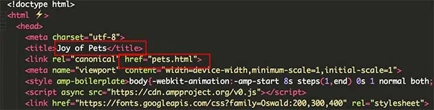
- Once you’ve downloaded the zip file from GitHub, open the zip file and then the HTML document pets-completed.html in Komodo Edit.
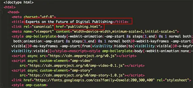
- Before moving forward, save a copy of this code in a new folder on your desktop. Since my story is about Pubtelligence and publishers, I saved my HTML file as publishing.html in a folder called Publishing AMP.
- Now, I have a copy of the code that I will edit directly, publishing.html, and the original code that I can use as both an example and a backup.
- From here, return to the pets-completed.html code and open it in a browser to see how the story looks before we begin customizing it.
- To do so in Komodo Edit, navigate to the horizontal toolbar at the top of the program and find View in Browser.
- From here, you can choose what browser you would like to open the file in; I’m most familiar with Google Chrome, so I selected the Applications/Google Chrome.app option.
- This will open the story in Google Chrome, allowing me to click through each page. I usually have this open while I’m editing publishing.html so that I can see what pieces of the code I like, such as a transition or effect.
What are some basics of HTML and CSS?
To begin, we first need to understand how HTML code is set up.
A basic HTML document will look as follows:
<html>
<head>
<style>
CSS-style-code {
}
</style>
</head>
<body>
</body>
</html>
<html> determines the type of document it is.
The <head> of the document includes all the foundation for the rest of the document, like link references, script sources, and meta charset UTF-8 (this tells the browser to use UTF-8 encoding so that your typed characters can be converted into machine-readable code).
Within the <head> is also the <style>. The <style> section is going to house all of your CSS code, which will style elements on the page.
After the <head> comes the <body>, which will include all of the HTML code for every page of your story.
One of the most important things to notice about writing HTML is that every item I just listed is also closed by </> and in the same order that it was opened, and for CSS, every item is opened and closed with { and }.
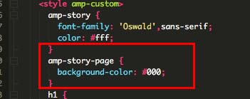
For example:
<html>
<head>
<meta charset=”utf-8″>
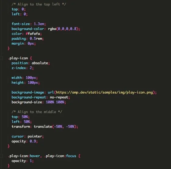
<style amp-custom>
amp-story {
font-family: ‘Oswald’,sans-serif;
color: #ffffff;
}
amp-story-page {
background-color: #000000;
}
</style>
</head>
<body>
<amp-story-page id=”page1″>
<amp-story-grid-layer template=”vertical”>
<h1>Cats</h1>
</amp-story-grid-layer>
</amp-story-page>
</body>
</html>
One of the most important rules of coding is to consistently use the browser to see how the changes you make perform. One misspelling, forgotten semi-colon, or missing angle bracket (>), and the code will fail to work.
Rather than making a large number of changes, the changes failing, and then going through all of your code to see which changes are causing issues, it’s best to make a few changes and then check the results in the browser.
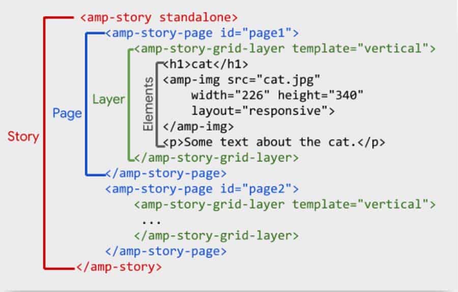
What are all of the parts in an AMP story?
AMP Stories are composed of pages, which is each new screen that appears when you click the ‘next’ arrow. Each page of a Story is made up of layers and templates. Each layer is created with elements; this can be text, photos, videos, background colors, or anything similar.
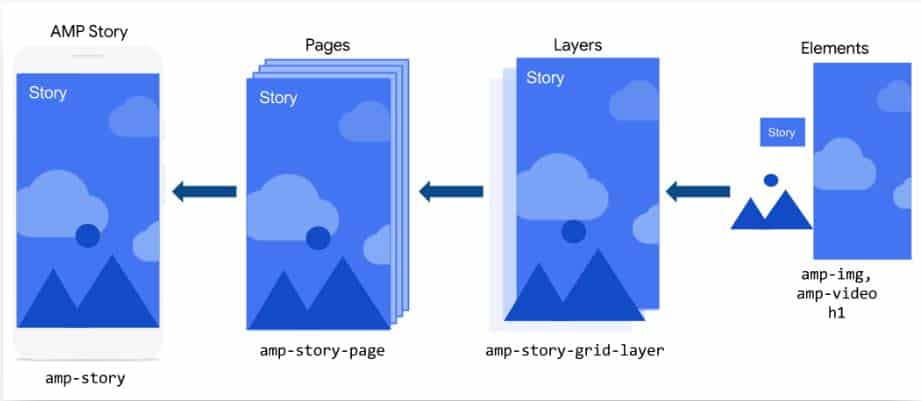
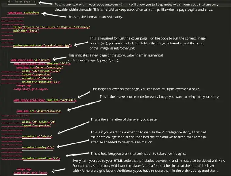
As you can see in this example, elements are made up of titles, images and image size, and paragraph text. The code for headings and paragraphs are tagged just like they are in WordPress.
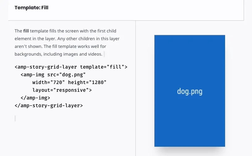
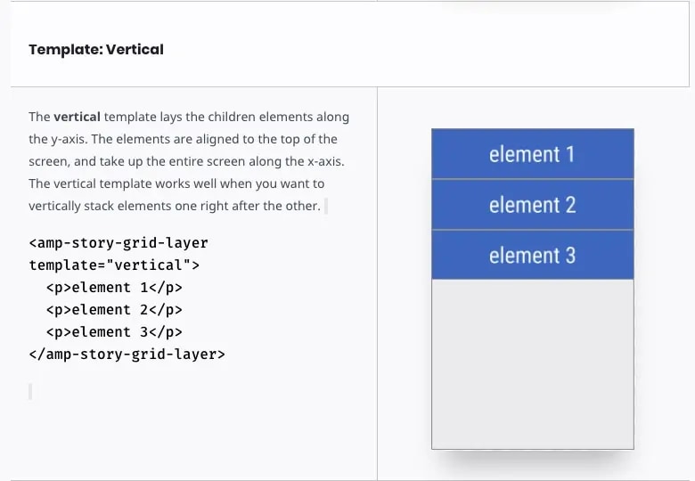
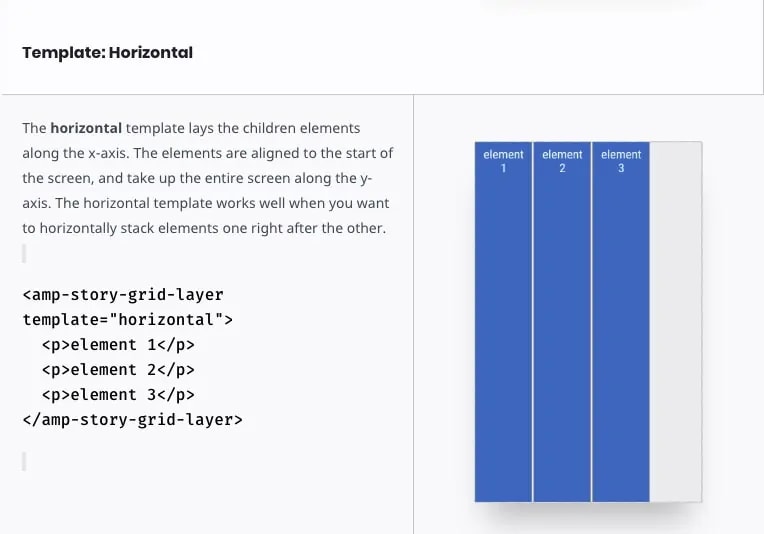
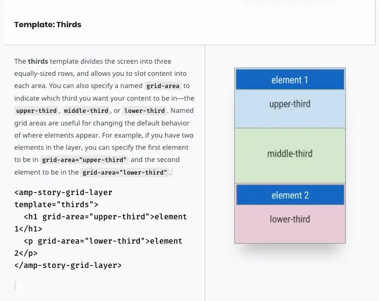
There are four types of templates to choose from–fill, vertical, horizontal, and thirds. As the guide shows below, the ‘fill’ template will fill the entire page, the ‘vertical’ and ‘horizontal’ will stack things along the y or x-axes, and the ‘thirds’ template allows you to place elements in the upper third, middle third, or lower third of the page.
There are many elements that go into an AMP story, but once you see and understand how each is broken down, it’s simply a matter of customizing a few pieces.
Customizing the code for your AMP story
Now, you’re ready to begin customizing.
All of the code in our publishing.html document is currently the code from pets-completed.html, so we need to start customizing some of the titles and names at the beginning of the code. A lot of this is going to stay the same because it’s structural rather than design.
The first part of the code we need to change is the title and href name, as shown below in red. You will change the href name to your particular html document.
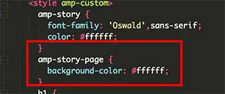
We’ll be customizing the CSS as we go along, but for now, I just changed the background for each page to white.
I went through each section of the pets-completed.html code and picked out what I liked and wanted to try in my story. Elements within the code can be customized, such as how an element animates in, how long it takes to animate, and how long it waits before coming onto the page.
A list of element animations is provided by AMP Stories.
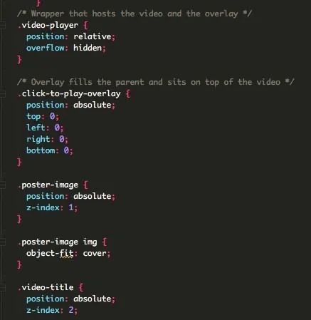
Sometimes, elements will have CSS that must be included so the element works and fits on the page. For example, here is the section of HTML for the video I used from the pets-completed.html code and then customized for my video:
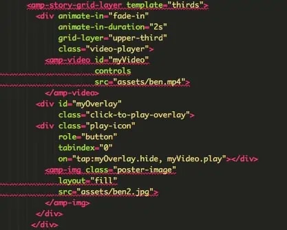
As you can see, there is code like this:
<div id=” “
class=” “>
This means that there is additional information in the CSS code that we need to include.
As you’re creating your story, you can customize the CSS for different elements, such as headers and paragraphs. If you want every h4 header to look the same across your entire story, you can manipulate it within the CSS code.
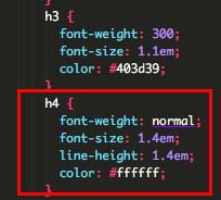
- Font weight is just like you would find in a Google document–you can choose from regular, bold, lighter, etc.
- Font size is measured in em’s. Text size is often a test of trial and error–change the em size, view in the browser, and make adjustments.
- Line height is how much space is between lines of text and is also measured in em’s.
- You can set each type of header or font type to have a different color.
There are many other ways to customize your story using CSS. If you’re looking for something specific, there are plenty of resources online. I often use w3schools for my HTML and CSS questions.
Using Photoshop to create and organize AMP story pages and layers
An easy way to make create an AMP Story page with a lot of complicated layering is to create the entire page in Photoshop and then save each element as its own file. Once Photoshop is open, create a new document that is the same size as an AMP story page: 720 pixels (px) by 1280 px. The resolution should be 72 pixels per inch (ppx), since this is for the web.
If Photoshop is daunting to you, we recently published a blog on how to use Photoshop to make a YouTube thumbnail, which includes a lot of basic Photoshop skills and tools. You can also download this design and Photoshop guide.
As I stated before, there are four different templates you can choose from for your story: fill, vertical, horizontal, and thirds.
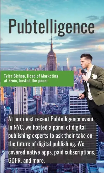
The first official page of the story is composed of multiple elements that each has its own layer in Photoshop.
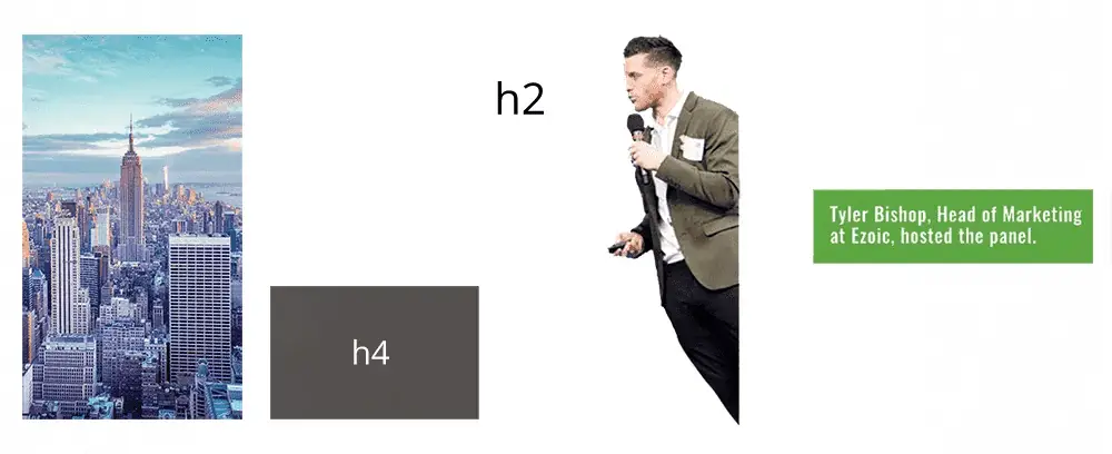
I saved each layer as its own image file, making sure to save the layers that require a transparent background (the one with Tyler and the one with his title, in green) as a png file since jpg’s don’t save transparency.
I don’t want any sort of colored background–even white–behind those two elements because I don’t want them to cover up the picture of the Empire State Building, the h2 title, or the h4 title and gray box.
When saving your elements, save them with a simple but descriptive title. For example, the first image is saved as newyorkcity.jpg and the opaque gray layer behind the paragraph text is transparentgray.png.
All elements you plan to use in your AMP story must be saved in its own subfolder within your main folder (in this case, Publishing AMP). Currently, every image within the code is coded as such: <amp-img src=”assets/nameofpicture.jpg”>.
To avoid having to change too much code, I labeled my elements subfolder ‘assets.’ This way, I only ever have to change the title and the file type of my elements. If your subfolder is not within your main folder, your elements are not within your subfolder, and you do not perfectly type in the name and file type of the element within the code, it will not appear in your story.
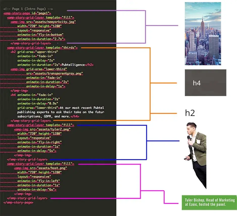
I used two different templates on the first page of my story: fill and thirds. I created a new layer within the code and made it a ‘fill’ template because I want the picture of the Empire State Building to completely fill the page. I made the animation ‘fly-in-bottom’ and set that animation duration for 2.7 seconds. Then, I closed that layer.
For the next layer, I used the ‘thirds’ template. As shown in the template guide above, I can decide if I want elements in the upper third, middle third, or lower third of the page. I knew I wanted the title at the top, so I created a new AMP stories layer for ‘thirds’ and then designated the h2 to be in the upper third and coded the gray box and the h4 text to appear in the bottom third.
I customized each element to animate in when I wanted, how I wanted, and for as long as I wanted. This took some toying around to get the timing right, but I just continually tested my changes in a browser tab. As I mentioned above, you can designate how every h1, h2, h3, h4, paragraph, quote, and more will appear in your story within your CSS code so you don’t have to set customizations every time you use one of those tags.
The next layer is the layer that includes my png of Tyler with a transparent background. Since the background is transparent and I pre-planned the size of the png in Photoshop, I used a ‘fill’ template. I used ‘fill’ for the last layer as well for the same reasons.
Once you’ve custom-coded the page, go through your code and make sure every tag you opened is closed, including the <amp-story id=”page1″>. This signals that you have no more code to include for the first page.
Use this process for each page of your story. Make sure all of your elements are saved in your ‘assets’ folder, and your html document and assets folder are in your main folder (Publishing AMP).
Putting your AMP story on the Internet
To get your story on your website, you will need to connect to your host and download an FTP Client. Zip your folder (mine is Publishing AMP).
Adding an AMP story to a WordPress website hosted on WP-Engine
1. Download FileZilla or the FTP Client of your choice
2. Connect to your host using SFTP credentials on FileZilla
3. Create a folder within the server files called “amp-stories”
4. Upload all of the files from the zip folder into the new folder on the server (amp-stories)
5. Rename the chrome link/html file to index.html
6. This results in a link to your website called www.yourwebsite.com/amp-stories
Questions or comments? Leave them below and I will do my best to get back with you.
Featured Content
Checkout this popular and trending content

Ranking In Universal Search Results: Video Is The Secret
See how Flickify can become the ultimate SEO hack for sites missing out on rankings because of a lack of video.
Announcement

Ezoic Edge: The Fastest Way To Load Pages. Period.
Ezoic announces an industry-first edge content delivery network for websites and creators; bringing the fastest pages on the web to Ezoic publishers.
Launch
Ezoic Unveils New Enterprise Program: Empowering Creators to Scale and Succeed
Ezoic recently announced a higher level designed for publishers that have reached that ultimate stage of growth. See what it means for Ezoic users.
Announcement