Website Usability Testing That Actually Works

Get helpful updates in your inbox
How To Do Website Usability Testing That Actually Works
One of the hottest topics in digital publishing right now is website usability testing. The problem is that this concept is often grossly misunderstood. Below, I’m going to show you how to do real data-driven website usability testing on your site.

Why do this kind of website testing? Sites that are actually able to improve website usability are able to improve user experiences; which have a direct impact on SEO, ad revenue, and your site’s brand (quality returning visitors).
Often publisher efforts to improve user experiences are heavily influenced by subjective opinions and not objective data. I’ll demonstrate below, why data integrity/quality is paramount to achieving positive results from these efforts. I’ll show you what data matters and how to do testing that will 100% make your SEO, ad revenue, and site’s brand better than it is today.
How do can we actually measure website usability objectively?
This is where we absolutely have to start this conversation. How are we going to measure and track website usability? It’s kind of an abstract concept without a clear scoring guide. Fortunately, there is a way of tracking user experiences that we can leverage to measure the impact of website element changes.

Looking at bounce rate, time on site, and pageviews per visit gives us a clear and proven way to measure user experience. There are other ways to look at this; however, this what Google is looking at in Google Search (SEO) and all of these metrics have a proven correlation with ad earnings as well. It is by far the best way for us to score our efforts in improving website usability.
These user experiences metrics are truly objective. It’s as if the users are voting with their clicks. You can view the results of every vote and compare them easily. Other methods can become a lot more distorted than this…
If a website can improve these stats they will also effectively improve SEO, ad revenue, and brand (hypothetically). However, I mentioned there are other ways to look at this as well… I’ll show you why those methods are dangerous and misleading…
Why heat maps, click tracking, and user video recordings are dangerous data tools
I have to admit, I’ve used all of these tools in the headline above. Heat maps, click tracking, and even actual user behavior footage seem like a foolproof way of measuring how users interact with your website. Unfortunately, it is a common case of objective information that requires a subjective analysis. Let me explain.

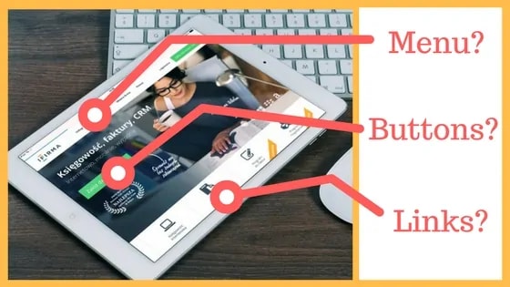
Above, you can see how a site owner may view their home page. This is actually my site. These are actual opinions I have about it. If I was to throw a heat map on it I may be surprised by some of the clicks. I might learn that the ad I thought was really popular isn’t being clicked, or that people are largely not using my top left menu… however…
I will have no idea why!

This is the big reveal with all of these types of tools. There’s nothing wrong with using them as a fun experiment but making decisions based on these tools is extremely dangerous for your website usability testing efforts. I’ve seen sites absolutely ruin their website’s user experience metrics by basing decision-making on these tools.
At least with bounce rate, time on site, and pageviews per visit as your metrics you can test different elements and use a consistent set of metrics to objectively see which is better. It’s kind of impossible to throw a heatmap over a site, make changes, and then throw another heatmap over it to measure progress (what will you use to determine if it really worked)?
I once worked with a large site that heat mapped their site for a month. When they were done, they KNEW that people weren’t clicking on their drop down menu because of the way it was ordered. Ultimately, they decided to rebuild the site and then place the most “important” navigation elements in the areas that the heat maps revealed as the places that users were clicking. The result? That site saw bounce rate rise considerably and session duration plummet. Their entire website redesign hurt their SEO badly for about 6 months.

This story is extremely common. As I type this, there are thousands of publishers calculating how they will redesign their entire website to make it friendly to users based solely on the way the site looks. Or worse, they are mislead by objective data with no actionable progressive measurement.
What’s more… this is often occurring on desktop. Publishers are obsessed with their desktop sites because it’s how they use and test their site; however, mobile traffic accounts for a large (in most cases the majority) of users. With the rise of mobile, publishers have to think about focusing website usability testing efforts towards mobile; which has very little to do with the way things look (think small viewport, limited options for something to look “nice”).
What website elements affect usability metrics and user experience metrics?
This is something that we have quite a bit of data on. When Ezoic first started, we actually bought hundreds and hundreds of site’s to test our artificial intelligence on. We learned a lot about what site elements tended to influence user behavior the most.

Here are the cliff notes…
- Menu location and other navigation features affect user experience (this is especially true on mobile. Do people like a button that says menu, a hamburger logo, or left-hand menu?
- Background color and design. Black backgrounds and white text are almost universally hated… almost.
- Ad density affects user experience in a big way; however, this can be more important on some pages than others (read more about that here)
- Pagespeed is important for users and most search engines. This is more true on mobile than any other device, but it must be accounted for in conglomeration with all other features.
Well… you probably want me to tell you more about what types of elements in these categories worked the best, right? That’s the thing, every user is different and every site is different. That’s why testing is so important. If possible, you should be trying to test all of these things on a per user basis using a multivariate testing methodology.
How to implement impactful website usability testing
So, we agree on how we’re going to measure our efforts, and we agree on what needs to be tested. Great. How do we get started?
Most publishers have a number of options, and it depends 100% on their goals. In many cases, if a site earns quite a bit of revenue from ads, I always recommend starting with ad testing. Ad placements have a major influence on user experience metrics and revenue (see the study here).

Ezoic provides the best way to perform automated data-driven ad testing; however, if you want to dip your toe in the water and simply do this yourself first you can start by doing simple A/B tests. You can use a free tool like Google Optimize to test one location vs. another.

Test position 1 at 50% and position 2 at 50% with all other elements remaining the same. Set your goals as bounce rate and pageviews per visit. The one with better session metrics will most likely perform better long term; earning you more revenue and helping with things like SEO.

If you want to go beyond ad testing — and extend into layout or elemental changes for your site — you have to determine how committed to these efforts you want to be. There are some fantastic multivariate layout testing tools that I strongly recommend; however, your site will legitimately test a lot of different layouts and will automatically deliver the ones with the best user experience metrics to users.

A lot of publishers aren’t ready for this kind of commitment. If this is you, you can use a number of tools that are out there (Google Optimize being free) that allow you to modify HTML elements of your site, set UX metric goals, and split test the results. This is a slow way to test changes but is a smart and safe way to do this.
Did menu A or menu B work better? Do people like buttons or text better as links? There are billions of things you could test (OK, maybe just millions).
Don’t ever do this
Ultimately, go as fast or as slow as you like. Digital publishers are rarely successful overnight so it’s really important that you’re thoughtful with all website changes.
With that in mind, the worse mistake I see publishers make is a total site relaunch. These projects are almost always a nightmare. They often require massively complex 301 redirect spreadsheets and are a total coin flip in the long run of whether or not they ever work out (unless it was to go mobile friendly, I’ve never seen one worth the effort).

What is a website relaunch? I mean building a whole new website on a test server and then pushing it live with redirects to all the new pages. This is a massive shakeup and Google is left scrambling when it indexes these new pages and almost always drops them all down a peg until the dust settles. SEO almost always tanks at first and eventually recovers.
Additionally, with all these changes, you have no idea how all these things will affect each other. You may do all this work and ultimately add zero improvements to website usability or user experience metrics.
In most cases, the most dramatic construction I recommend doing testing is things that can be easily be changed back after the data is out. Things like changing a site’s “theme” (in WordPress or Joomla) or rebuilding different site elements — like mobile navigation.
The final work on website usability testing
There’s no doubt this topic is hot right now. Digital publishers — both small and large — know that user experiences are paramount to their growth moving forward. When I talk to publishers about their number one goal, a large number are now telling me it’s user experience.
This is fantastic; however, it has to be data-driven. You can waste a lot of time trying to improve website usability for users if you aren’t looking at those core user experience metrics I discussed above.
Now it’s time to sound off. Do you disagree with anything I’ve outlined? Have you have done testing on your site before? What were the results? Share stories below. I love learning from other publisher’s experiences.
Tyler is an award-winning digital marketer, founder of Pubtelligence, CMO of Ezoic, SEO speaker, successful start-up founder, and well-known publishing industry personality.
Featured Content
Checkout this popular and trending content
Ranking In Universal Search Results: Video Is The Secret
See how Flickify can become the ultimate SEO hack for sites missing out on rankings because of a lack of video.
Announcement

Ezoic Edge: The Fastest Way To Load Pages. Period.
Ezoic announces an industry-first edge content delivery network for websites and creators; bringing the fastest pages on the web to Ezoic publishers.
Launch
Ezoic Unveils New Enterprise Program: Empowering Creators to Scale and Succeed
Ezoic recently announced a higher level designed for publishers that have reached that ultimate stage of growth. See what it means for Ezoic users.
Announcement