Website Layout Ideas & Tips From Top Publishers & Blogs

Get helpful updates in your inbox
Website Layout Ideas & Examples From Top Publishers & Blogs
Study after study continues to show the significant impact that a website’s layout plays in both the visitor’s experience and the total amount of revenue a publisher generates from ads and other digital revenue sources.

Website layout directly impacts how a visitor browses content and navigates from page to page.
The visitor’s engagement in the content, and the number of pages they visit, directly impacts the total number of ad impressions they see and the value of those impressions to advertisers on your site.
Below, I’ll review website layouts from across the web. We will look at several key things that many of the top sites have in common. I’ll also share some insights into why one site might choose something totally different from another using real data.
What website layout tips can we get from top news and media sites?
Let’s take a look at some of the most popular news and information sites. This should give us some insights from some of the world’s most popular publishers.
I picked 20 well-known news and media sites from across the web. I tried to make sure I included several that have well-publicized data science departments.
[ It is probably worth pointing out that it is really important to read all of the data in this article prior to jumping to any conclusions about what may work for your website. As we have shown before, redesigning your website can offer terrible ROI. In fact, the best research in the market suggests visitor segmentation may be the best way to approach website layout changes. ]
Looking at these 20 websites, I thought it would help put things in context by first understanding what the sites look like to visitors. I started with some of the more physical layout components.
Popular desktop sidebar location

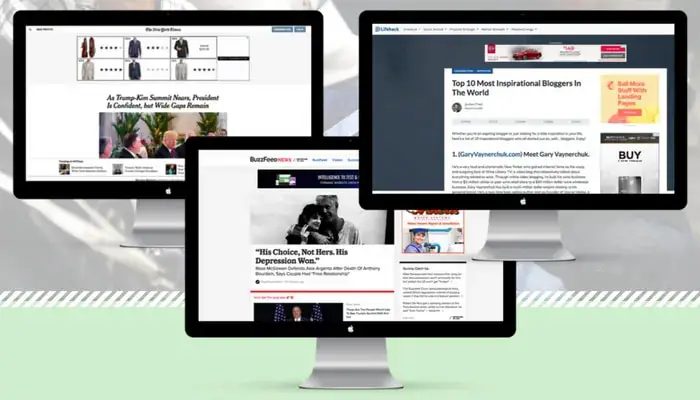
Starting on the desktop version of the sites, it appears as though a right-aligned sidebar is the most popular amongst this group of sites.
Lifehack.org is a good example of this. They include both menu items, ads, and links to related articles in their right-aligned sidebar.

The next most popular desktop layout was no sidebar.
A good example of this is the New York Times. They include large banner ads at the top and floating ads at the bottom to make up for the lack of sidebar ad inventory.
Additionally, they include ad locations throughout the article and push all related article links and widgets to the bottom of the page.

Most popular mobile menu type
Desktop website layouts get a lot of fanfare; as it is often how publisher look at their own sites, but statistically, most visitors will see the mobile version of a website.
Mobile menus can play an important role in pageviews per visit. The locations and type of menu have been shown to impact visitor behavior.

The most popular form of overall menu type was a “hamburger” style menu. 90% of the sites we studied used this style.
The other 10% used a button labeled “menu”. These were the only two styles used among these 20 sites.

The hamburger menu has become a well-recognized symbol for a mobile menu.
The adoption of this style of menu from many top publishers suggests that users have come to recognize this symbol without much confusion.
As you can see above, there are many variations of this popular style.
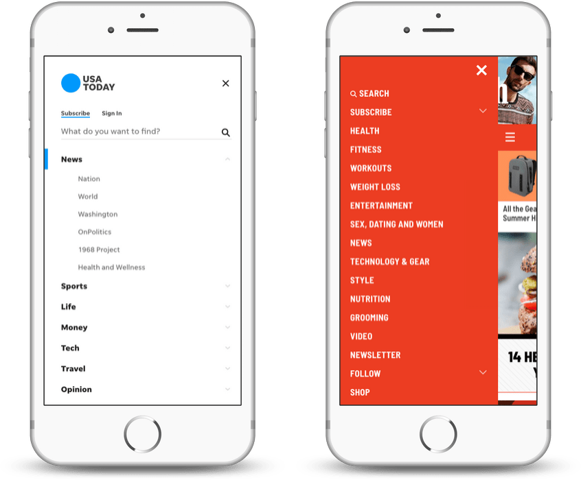
The two most popular implementations of a hamburger menu were to bring the menu into fullscreen and also to bring the menu in as a left-side popout.
In the example above, you can see that USA Today uses a hamburger menu that expands to a fullscreen style of navigation.
Men’s Health uses a similar menu style and location but has their navigation simply pop-out from the left-side of the screen.
For what its worth, in this small sample size the left-side popout style of navigation was six times more popular than a right-side popout style of navigation.
Where were the majority of ads in these website layouts?
We know from tons of research that ad locations, types, and density play a huge role in user experience metrics and overall ad revenue.
We also know that more ads can often mean less money overall!!!
That said, where are some of these larger publishers choosing to put the majority of their ads?

As you can see, the most common location that these types of publishers overlap is ads above the fold.
This was once considered a bit of a controversial subject, but something that has definitely become the norm.
Last year Google lifted the ban on 300 x 250 sized ads above the fold on mobile devices, and now this is a very common size to see on these popular publisher sites.

Of these 20 sites, 95% displayed more than 1 ad type. You can see that every single one of them leveraged display ad units for monetization.
Aside from display ads, native ads — or content recommendation widgets — appeared to be the second most popular ad type.
What we continually learn from data is that testing makes all the difference.
Most of these sites are showing different combinations because they have found their respective combinations to work best with their visitors.
The best emerging research here suggests that every visitor should actually be treated differently.
In fact, Website Visitor Segmentation Offers Big Ad Earnings Value For Little Work
This case study had some pretty interesting things to say about treating visitors differently.

It showed that by identifying and tracking user behavior that publishers could increase ad revenue and objectively give visitors a more engaging experience by slightly changing ad combinations based on how similar visitors had responded to these elements in the past.
Did these publishers regularly include website slideshows?
Slideshows — or swipable content on mobile devices — usually have both proponents and detractors.
Sites that use these mechanisms obviously hope it will lead to users visiting more pages, and thus more ad impressions and pageviews.
However, this may not always be a good thing. Detractors would point to research on navigation bounces and the impact on page engagement time as reasons why these features should be avoided.
Ultimately, every site should be testing this stuff for themselves. But, what about our 20 popular publishers?
How many used slideshows or suitable content to lead visitors through their site articles?

If you’re interested in measuring how slideshows impact your navigation bounces or overall engagement, you can do it for free using Ezoic’s Big Data Analytics.
We’ve found a direct correlation to engagement and ad rates from advertisers.
How many images are these publishers using in their articles?
We know that word count can play a huge role in engagement time — and that it varies from site to site — but what about image count?

Many publishers will only use one image at the top of the page to kick off the article (Wired is a good example of this).
But, how many use more images than that?
Less than you might think.

Only 25% of the sites used 3 or more images. The most common website layout for images was to only use one image at the top of the article.
Only 1 site in the sample size had no images in its typical article.
Surprisingly, only having 2 images was pretty uncommon as well.
Where did they ask for visitors to subscribe to newsletters?
A major trend among these major publishers is to build and expand their readership. Many are trying to build subscriber lists or newsletter lists to maintain a connection to their audience.

As most publishers continue to reduce reliance on Google and Facebook for traffic, what can we learn from these publishers about where they try to engage visitors for subscriptions or newsletter sign-ups?
There was a lot of diversity here with no clear winner among these publishers.

The most common place to find these types of calls to action were in the publisher’s sidebar.
This is a stark contrast with — the much more aggressive — pop-up window that was the second-most-popular form of newsletter or subscription sign-up.

The Washington Post is a good example of someone who uses both a fixed menu item and a sidebar call to action for subscription advertisements.
What to look for when testing website layouts
As you would probably imagine, few of these publishers are blindly implementing these practices.
Likely all of these popular publishers are implementing some form of testing to determine which layouts help them deliver the right balance of visitor experience with total website revenue.
This is actually a more difficult equation to solve than most people think.
A/B testing is actually a suboptimal solution for website layout testing if you’re a publisher.

It’s pretty easy to see in this example why simplified testing generally results in untrustworthy results in the world of publishing.
Imagine you test 1 image vs. 2 on a typical article. 60% of the visitors prefer 1 and the other 40% prefer 2.
An A/B test would mean that you would eventually opt to show everyone 1 image instead of 2 (since that’s what the test results showed was best for the majority).
Unfortunately, the 40% of people that may have visited more pages or engaged better with 2 images on the page are now forced into a subpar experience.
The best action for this type of website layout testing is to implement multivariate testing.
Once you have the results of these experiments, publishers should consider visitor segmentation as a means of delivering each visitor a more preferable experience; based on your new testing data.

This is what some of the most sophisticated publishers today are doing. See the example above of a publisher that tests and delivers ad locations differently based on previous visitor tests.
Here’s an easy way to do this form of testing on ads that is easy and free to use. You can also do this more broadly with website layouts here.
What determines a good experience from a bad one?
This is something we covered in a bit more detail here.
There is a phenomenon known as Fake UX. It is essentially the manipulation of objective metrics like time on site to falsely simulate a good visitor experience; despite the experience actually being bad.
For example, time on site being high isn’t necessarily great if the person is spending lots of time waiting for a page to load.
The best way to determine good experiences from great ones is to look at engagement metrics.

Both of these metrics help sort through when visitors are scrolling through pages quickly, bouncing quickly from internal pages, or waiting for pages to load.
You can track this automatically for free using this analytics app.
What should we learn from this?
It is obviously very interesting to see what top publishers are implementing on their sites.
This gives us some insight into what these publishers may have tested and ultimately decided worked best for their goals.
What we can’t see are the results of their testing and business motivations behind many of these decisions (are they more focused on subscriptions than visitor revenue).
It is almost always best to do your own website layout testing and to sort through your own visitor segments to identify ways to improve experiences for your visitors and boost overall website revenue.
Questions, thoughts, opinions? Leave them below and I will answer them as they come my way.
Tyler is an award-winning digital marketer, founder of Pubtelligence, CMO of Ezoic, SEO speaker, successful start-up founder, and well-known publishing industry personality.
Featured Content
Checkout this popular and trending content

Ranking In Universal Search Results: Video Is The Secret
See how Flickify can become the ultimate SEO hack for sites missing out on rankings because of a lack of video.
Announcement

Ezoic Edge: The Fastest Way To Load Pages. Period.
Ezoic announces an industry-first edge content delivery network for websites and creators; bringing the fastest pages on the web to Ezoic publishers.
Launch
Ezoic Unveils New Enterprise Program: Empowering Creators to Scale and Succeed
Ezoic recently announced a higher level designed for publishers that have reached that ultimate stage of growth. See what it means for Ezoic users.
Announcement