The Effect of Ad Color on Ad Performance

Get helpful updates in your inbox
How ad color affects ad performance
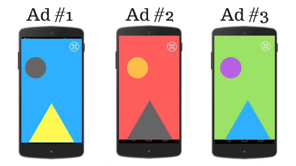
Ad color has now been proven to be extremely important in online advertising and publishing. It is one of the most immediate forms of communication — and can be used to improve the way your ads and articles are perceived. You’ll see below, the importance ad color has on ad performance.

Psychological studies of our reactions to color differ wildly in their results. One study finds that football teams are more likely to lose when the opposing team wears red, while another finds that you are more likely to find a woman attractive if she is wearing red clothing.[1] [2]
So what do we know about ad colors after reviewing all the information in the industry and examining over 23,000 sites using our platform for testing?

Important: Be objective about ad color
The most reliable advice we can rely on is that ‘elements such as personal preference, experiences, upbringing, cultural differences [and] context’ all have a huge influence on our reaction to color, rather than each one causing us to have one ‘hyper-specific’ emotion. [3]
However… this is all the more reason to rely on objective data rather than your own personal preference. The takeaway from the above info should be that everyone has varying preferences. So, it’s no wonder ad color has wild variances of ad performance depending on color as well. So how to go about finding the best color scheme for your audience? Do your research…
So how to go about finding the best color scheme for your audience? Do your research…
Tailoring ad color to your audience
Tailoring your use of color to your target audience is essential. For example, a Western person might more commonly associate the color white with purity and chastity — think Shakespeare’s idiom ‘pure as the driven snow’. But for somebody in the Middle East or Korea, white is commonly associated with death and mourning.
Let’s try another example:

Imagine you are advertising a game of chance. If you were targeting a Chinese market, it would make complete sense for the color red to be featured heavily as it carries connotations of wealth and luck. But, using the same palette in the United Kingdom would be completely inappropriate to the task, as in Western culture red often means danger and urgency. [4]

So it’s important to take cultural demographics such as this into account. But which other factors affect our response to color? Gender is one way that consumers are divided, and the preferences of the sexes may surprise you…

It’s actually a myth that women tend to prefer pink — in one study only 5.3% of respondents who identified as female stated a preference for pink. Compare this to 24.9% who liked blue best and 27% who preferred green. Men, however, seem to remain true to chromatic gender stereotypes, with a whopping 45% of respondents in the same test preferring blue over all other colors. [5]
These rules can be helpful for guiding principles, but it is important to remember that reactions to specific colors aren’t a foolproof science, especially when talking about stated ‘preference’ rather than demonstrated behavior.
However, there are some hard and fast rules on the way that colors interact, which make life a whole lot easier. Our eyes and brains are hard-wired to respond certain ways to certain combinations of colors, and knowing these simple tricks is key to effective visual marketing:
Rules of ad color

1) High Contrast Is Eye-catching
On our most primal level, humans are hard-wired to notice contrast because it helps us to differentiate between shapes more easily.
Russell Foster (professor of circadian neuroscience at the University of Oxford) describes the ability to see contrast as ‘the whole point of color vision'[sic]. [The Telegraph] The way the eye is drawn to contrasting colors is a built-in function. However, it’s good to be wary of overusing this technique- think of it as using a highlighter pen- highlight everything and nothing stands out anymore. It’s also really annoying to look at for long periods!
So use high contrast— use it sparingly — and you will get noticed.

2) Opposites Attract
Some colors just do not work well together and combining them can be off-putting. If you want to use two contrasting colors which are easy on the eye, a hard and fast rule is to choose ones on the opposite side of the color wheel. These are known as ‘complimentary’ colors.

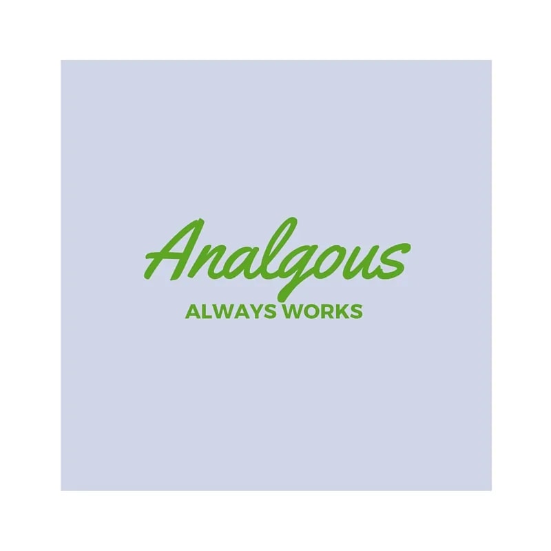
3) Analogous Always Works
If you want to use complimentary colors, but do not want to draw undue attention to the text or image you are creating, then it’s a really good idea to use analogous colors- i.e. next to each other on the color wheel. This is a great idea for informational sites as it has been proven that we remember analogous or ‘harmonious’ color combinations more effectively than contrasting ones. [6]

4) Shade and Tint Complement

Shade is when black is added to a color. Tint is when white is added. Using different shades of the same color will always look good and is a subtle way to direct attention to different areas.
The rundown
Combine the four rules above on your website / advertisement to make a color palette that achieves your chosen goals. A useful tool for this is an interactive RGB wheel like the one at Sessions.Edu. Start with a color that appeals to your chosen market, and find one or two analogous partners. Use different shades and tints to highlight different areas, and create high contrast in areas which you want to stand out.
Featured Content
Checkout this popular and trending content

Ranking In Universal Search Results: Video Is The Secret
See how Flickify can become the ultimate SEO hack for sites missing out on rankings because of a lack of video.
Announcement
Ezoic Edge: The Fastest Way To Load Pages. Period.
Ezoic announces an industry-first edge content delivery network for websites and creators; bringing the fastest pages on the web to Ezoic publishers.
Launch
Ezoic Unveils New Enterprise Program: Empowering Creators to Scale and Succeed
Ezoic recently announced a higher level designed for publishers that have reached that ultimate stage of growth. See what it means for Ezoic users.
Announcement