Small Website Changes That Can Deliver Big Improvements

Get helpful updates in your inbox
Small Website Changes That Can Deliver Big Improvements
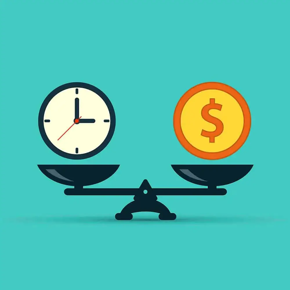
In 2017, American Airlines elected to remove one olive from their olive trays in their passenger snack platters. This resulted in over $40,000 in annual savings. The cost of the olives and the weight of the snack platters resulted in a significant amount of money saved across all American flights for an entire year.
Webmasters and website owners understand this principle. Small website changes applied across large audiences can have dramatic effects on user experiences, SEO, and total revenue.
So, what things can be changed? Why should you change them and how should you approach this process so that you can ensure that your changes cause improvements and not declines.
[This blog is from a recent presentation I did at Pubtelligence West in Santa Monica, CA alongside Google]
Watch A Presentation From Pubtelligence On This Subject
What website experiments can offer the best results?
Everyone has heard stories of Amazon changing their checkout button from green to orange and then finding out that the orange button produced a 100% increase in checkout rate.
Or, the story of a famous mobile game that changed their mobile layout and font only to see their ad revenue triple within 20 minutes of making the change.
These famous experiments highlight something critical about the way publishers should be experimenting with their websites.
Small changes offer big results with little risk. Major redesigns — and wholesale changes to the way a website looks or publishes content — leave too many variables to properly evaluate.
The most successful — and often fruitful — changes a publisher can make are small ones that are based on data.
Typically, there are a handful of small things we’ve found to offer pretty big results. At Ezoic, we see this across tens of thousands of websites. Here’s what typically is most important to test.
What should you test on your website?
There are a few core things that have an effect on user behavior. User behavior directly impacts SEO and total session revenue from ads.
- Navigation
- Content layout
- Image layout
- Background colors
- Ad position
- Ad density
- Ad types
- Ad colors
- Font
- Presence of video
There are a number of other variables, but these are some of the most impactful ones.
Here’s the catch…
Navigation may affect user experiences — thereby influencing SEO and ad revenue — however, you may not know how your audience will respond to certain changes.
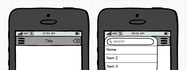
I wish I could tell you that a navigation menu on the top right of the screen in a hamburger style menu is the best for everyone…. except, it’s not.
I mean… sometimes it might be. But, definitely not all the time.
So, how should you test these things to make small website improvements?
Running successful website tests
Let’s start with an example…
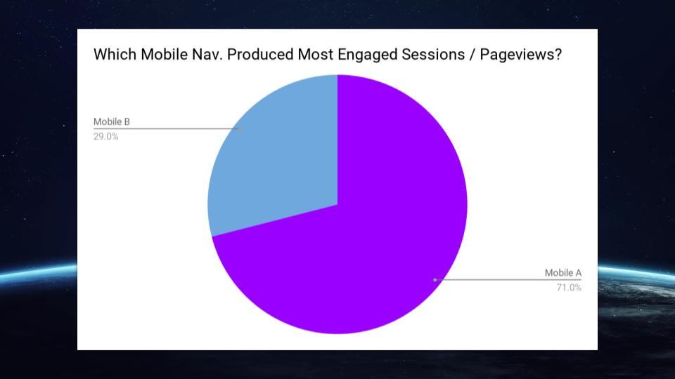
On this website, we tested two different kinds of mobile menus on their entire audience. Both were right hand side menus. One was red and slid out from the left, the other was white and displayed in fullscreen.
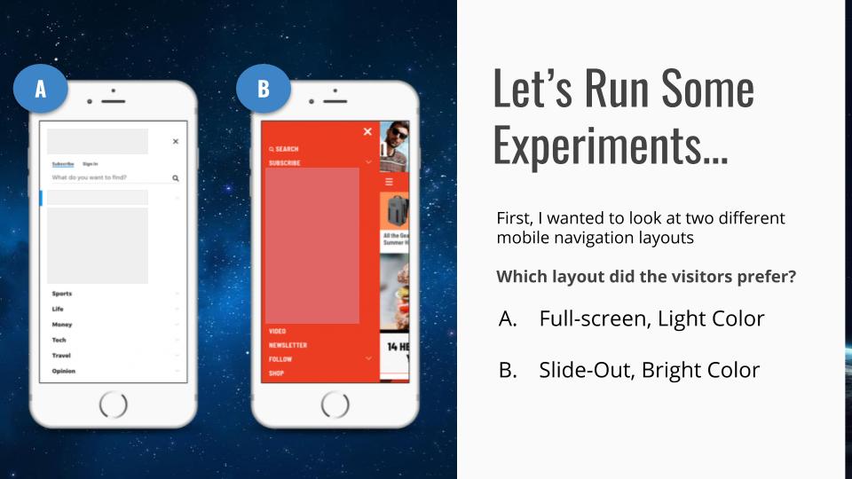
Which do you think performed better?
Note: Every website sees different results with this test so please do not take these results as a means of making decisions for your website.
In this case, the fullscreen, white menu produced sessions that saw more engaged pageviews per visit. This meant that this menu was positively influencing user experiences — on average — more than the slide-out menu with the red color.
Let’s try another experiment with a different variable this time.
On this website, we are going to look at the different ad combinations. One includes two small ads at the top and bottom of the page. The other is going to display a single 300×250. We want to see how user experiences are affected by these two different combinations so we decide to look at bounce rate and pageviews per visit.
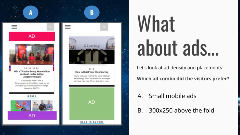
Which do you think performed better?
Not adjusting for revenue, the 300×250 produced a better user experience — on average — in this experiment.
Does that mean you should always show visitors a single 300×250 on mobile rather than two smaller mobile ads? Probably not.
In fact, only 65% of people performed better with the 300×250 ad. The other 35% performed better with the two smaller ads.
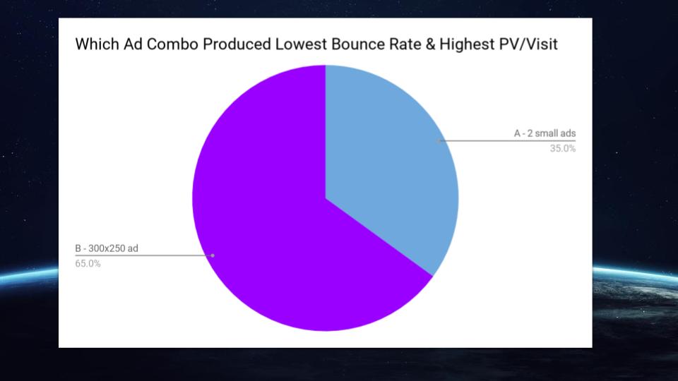
This once again proves the overwhelming value of visitor segmentation.
Segmenting visitors and giving each one the combination that performs best is the ideal outcome.
A/B testing is a really popular form of approaching these kinds of experiments, but the classic A/B testing model is not really optimal for website performance.
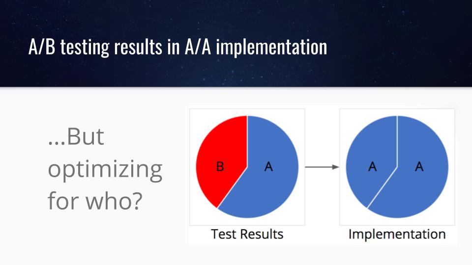
If we look at one of our variables from our last example, the 300×250 ad, let’s imagine it won an A/B test. Perhaps it performed better in 53% of sessions. That means that just over half of the visitors had better experiences.
The rest possibly had worse experiences.
The best scenario is pretty easy. Find out what audiences in the 53% had in common and deliver the winning test results to them and not the 47% that preferred something different.
There are a ton of proxy tools that allow you to do this easily without any coding, etc. Many of them are free.
Ezoic does this automatically. Users can set up any number of experiments and the system will optimize for user experiences and revenue automatically.
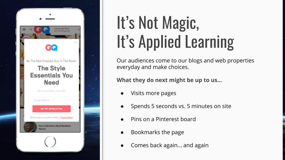
What about small changes to content? Is that good or bad to do?
The implementation is key here as well, but it is really important to understand how visitors interact with your content.
We went into this a little bit more when we talked about word count a while back.
To give an example of how you could do this successfully using something like Google Analytics, I’ve included an example below.
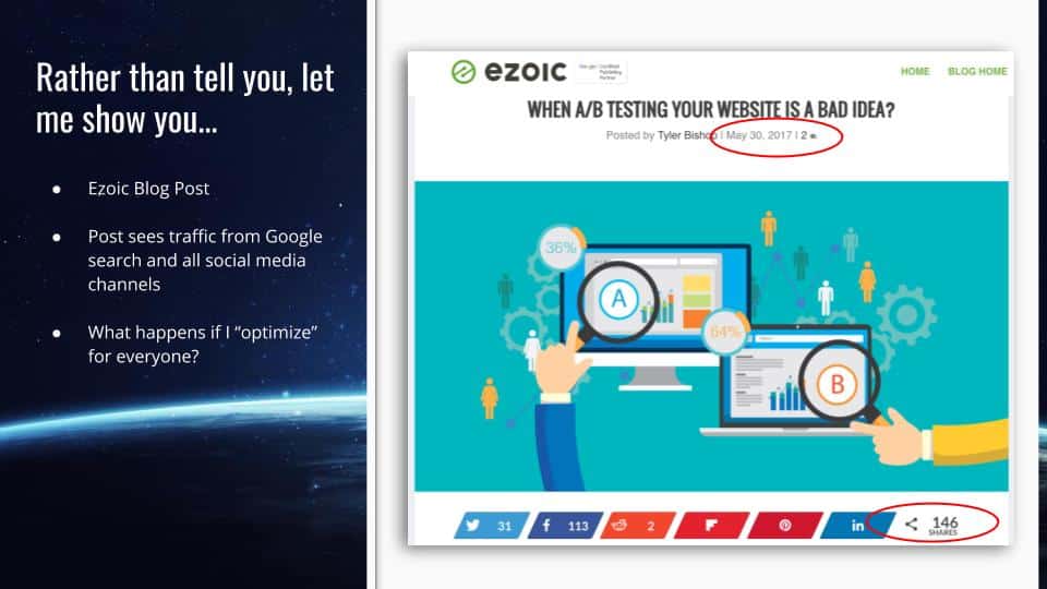
In this case, I decided to test out something simple on that blog post I wrote a while.
The blog is nearly a year old and has some great baseline data for me to explore.
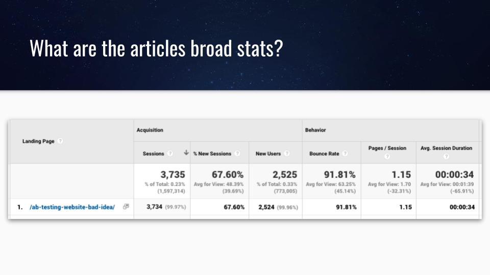
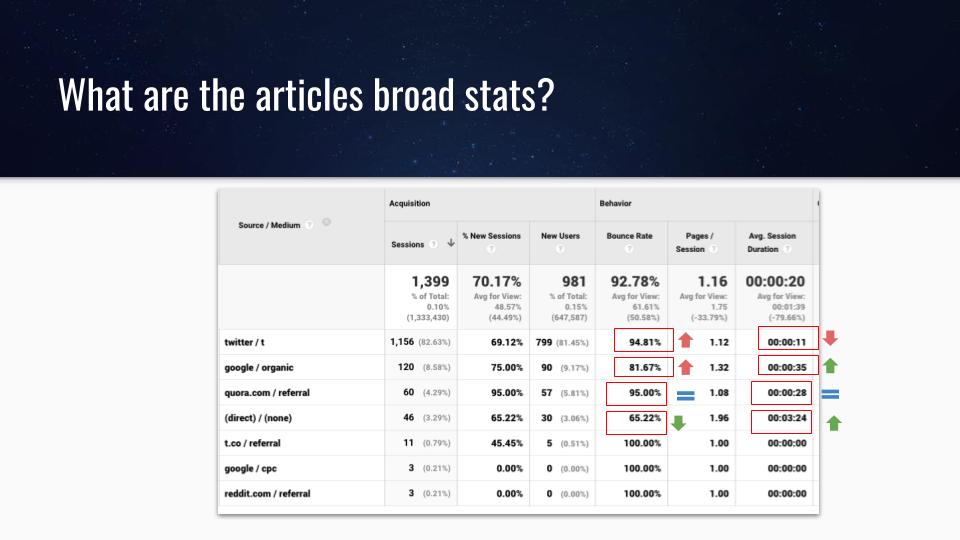
As you can see, there’s probably some room for improvement. However, rather than looking at the article broadly, I should probably look at it by traffic source to get a clearer and more objective look at how it’s performing with different audiences.
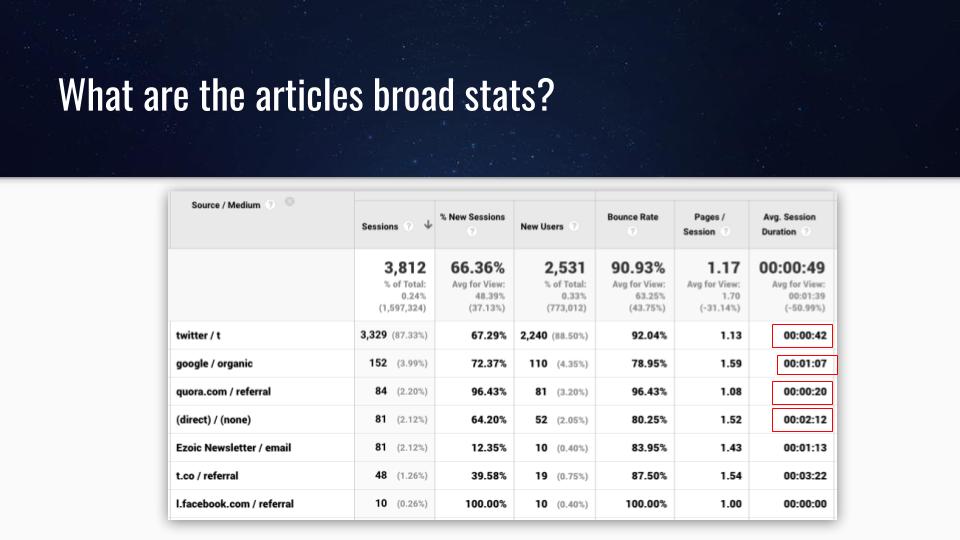
This paints a slightly different picture. As you can see, my organic visitors have a session duration that is 2x higher than the average. My direct traffic is nearly 4x higher!
If I run an experiment that affects the average, I’ll want to make sure that it isn’t negatively impacting these audiences that are already performing better than average.
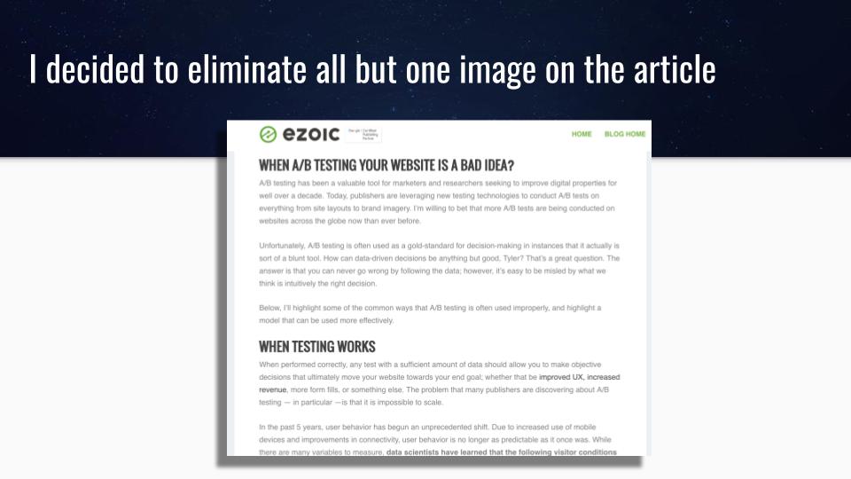
My website experiment – testing image density
Using the article and data above, I elected to eliminate all but 1 image in the article. I decided I would measure how this affected overall user experiences.
The hypothesis could be that images interrupt the reader and slow down the page. Let’s see if this positively or negatively affects my audience.
So, how did this affect visitors viewing this article?
Well, it’s a bit of a mixed bag.
My bounce rate went up on my visitors coming from Twitter and Google Search. However, it went down with my direct visitors.
What’s more, Just about everyone — except for Twitter visitors — saw improvements in session duration.
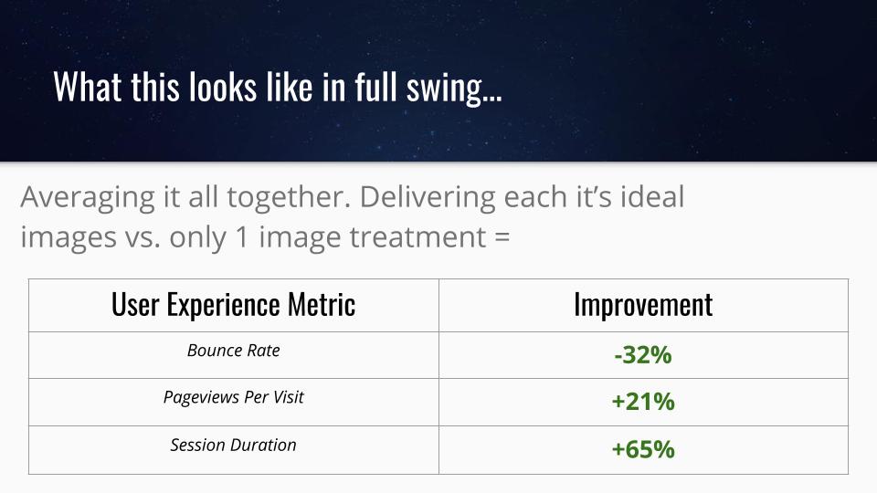
If instead of choosing one or the other (multiple images vs 1 image) I elected to deliver each traffic source it’s ideal preference, I would see significant improvements in user experiences.
User experiences have an exact correlation with ad revenue per visitor as well. So, the publisher stands to see more than just usability metrics improve. They will likely see revenue improvements with changes like this as well.
Wrapping it all up
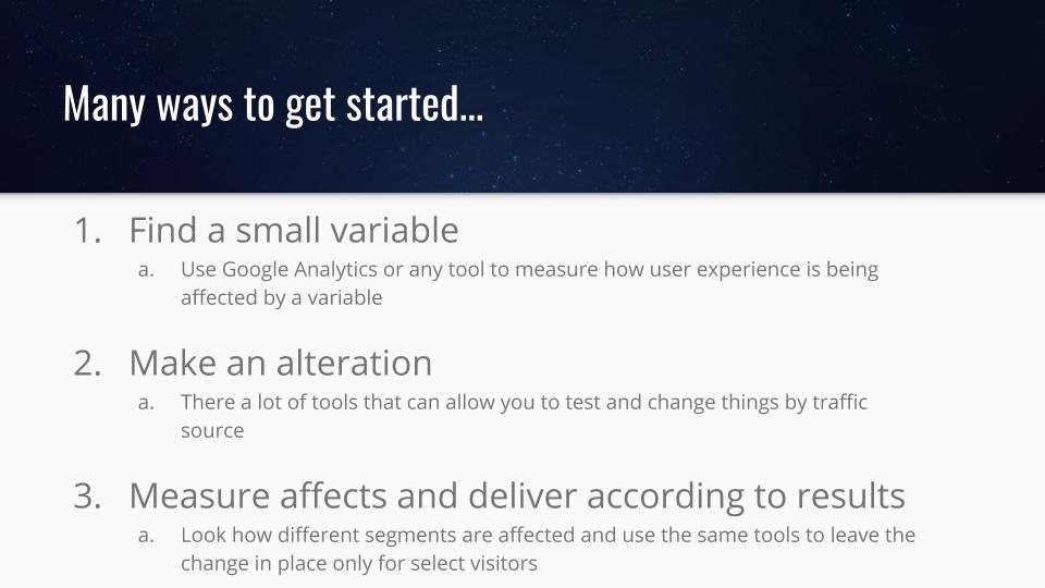
If you’re interested in making changes on your website to improve revenue or user experiences the secret is to start small.
Often, small changes can be viewed as non-significant, but that is not the case when you deal with large audiences.
Small changes are often the only ones that you can control. Large website redesigns are not recommended — as they are often dice rolls at improving the way a site works.
Thoughts, questions, ideas? Share them below.
Tyler is an award-winning digital marketer, founder of Pubtelligence, CMO of Ezoic, SEO speaker, successful start-up founder, and well-known publishing industry personality.
Featured Content
Checkout this popular and trending content
Ranking In Universal Search Results: Video Is The Secret
See how Flickify can become the ultimate SEO hack for sites missing out on rankings because of a lack of video.
Announcement

Ezoic Edge: The Fastest Way To Load Pages. Period.
Ezoic announces an industry-first edge content delivery network for websites and creators; bringing the fastest pages on the web to Ezoic publishers.
Launch
Ezoic Unveils New Enterprise Program: Empowering Creators to Scale and Succeed
Ezoic recently announced a higher level designed for publishers that have reached that ultimate stage of growth. See what it means for Ezoic users.
Announcement