Mobile First Indexing – Google’s New Ranking Experiment

Get helpful updates in your inbox
What is Mobile First Indexing?
Google announced on November 4th that they are launching Mobile First Indexing in their search rankings. This is part of their ongoing commitment to improving search results for Google users- but what does it mean for your website?

How does mobile first indexing work in Google?
Google is keeping the single index for websites and apps, but is beginning to ‘primarily use the mobile version of a site’s content to rank pages from the site’. Essentially, Google is now starting to roll out a ranking system where the entire site (desktop results included) is ranked according to how well the mobile version performs. This won’t be in effect immediately, as Google is starting on a smaller scale before they ‘ramp up’ in the coming months. As they refine the algorithm and ranking signals, Google will gradually start to roll out this indexing update across the board.
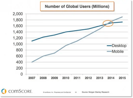
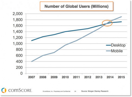
As the number of people using mobile devices to access the internet overtook desktop back in 2014, this is a logical way of ensuring that the majority of users get a positive search experience. If your site isn’t already mobile-friendly, now is the time to take the plunge!
Wait – Didn’t this happen already? NO! This is big and has some major ramifications for those that rely on organic results for traffic.
This is different from Mobilegeddon
The ‘mobilegeddon’ update announced in April 2015 told us that Google will be ‘expanding… use of mobile friendliness as a ranking signal’. Mobile First Indexing is an interesting progression of this theme. It’s the first concrete announcement on how Google intends to shift their focus towards mobile ranking. In fact, Google will only be looking at how your site performs on mobile to determine how it should rank.
 Just because your site is already responsive or dynamic serving does not mean you can sit this one out. But, if your site is not mobile-friendly, you will almost certainly see considerable drops in rankings.
Is my site Mobile Friendly and is it indexed properly?
A good place to start is Google Search Console’s new Mobile-Friendly Test. This was released in May 2016 and is touted to eventually replace the old Mobile Friendly tool. At the very least you should make sure that the site is mobile friendly according to this tool.
Google Crawler Access
Remember that Google can only rank things that the Googlebot (sometimes called the Google spider) can find! You can use this tool to check that your robots.txt file is accessible.
I’m mobile-friendly. Am I still at risk?
YES! If your site is already mobile friendly you’re bang on trend with Google’s push towards providing better user experience on all platforms (which is increasingly mobile). However, mobile first indexing means that Google will use mobile rankings for all rankings in the future. This means if your mobile ranking now is lower than your desktop ranking that you will see all rankings at the lower mobile ranking in the future.
There are a number of great SEO tools you can use to monitor keyword rankings by engine to see how your pages do on mobile vs. desktop. These will help you see how much risk you may have in this change. If your mobile version of pages ranks much lower than desktop, then you have work to do.
Another great indicator of this is your user experience metrics on mobile. If you aren’t already monitoring these then now is a great time to start.
Mobile metrics to monitor in Google Analytics:
- The % of your users who bounce from your site.
- How many pages your average user views.
- How long each user spends on site.
Nobody can say with certainty what factors exactly Google uses to rank sites- but here at Ezoic we’ve spent years optimizing thousands of websites, and we’ve found significant correlations between improvements in user experience metrics and improved rankings. In light of the new mobile first ranking signal, it’s probably a good idea to check out these metrics specifically for mobile devices.
Test Your Mobile Site!
It’s important to remember that what is ‘mobile friendly’ is not an exact science- and your metrics are going to be different for different users. There are some common truths, like fitting the content to the screen width and making it as easy as possible for the user to navigate, but to get the absolute best results from your mobile site, you need to account for different user behavior.
You can get a really basic demonstration of this in the ‘devices’ breakdown of your mobile analytics- is your bounce rate consistent across different high-end devices?

Visitors on different devices are likely to interact with your site differently- and this is just the beginning. Things like time of day, location, ad setup, all have a big impact on the experience that a user needs.
Ezoic provides a free to use Mobile Friendly Tool, which automatically makes your site mobile-update ready. More than this, it will serve the best mobile friendly template to each different user, according to their behavior. The average user spends 45% longer on an Ezoic optimized mobile site, and they are 79% more likely to stay on the site. Whether you use a testing platform or do it manually, the key message is to keep testing to really nail down your websites mobile performance.
[1] https://webmasters.googleblog.com/2016/11/mobile-first-indexing.html
[2] https://webmasters.googleblog.com/2015/02/finding-more-mobile-friendly-search.html
[3] https://www.smartinsights.com/mobile-marketing/mobile-marketing-analytics/mobile-marketing-statistics/
[4] https://webmasters.googleblog.com/2016/05/a-new-mobile-friendly-testing-tool.html
[5] https://developers.google.com/webmasters/mobile-sites/get-started
[6] https://www.ezoic.com/layout-tester/
Featured Content
Checkout this popular and trending content

Ranking In Universal Search Results: Video Is The Secret
See how Flickify can become the ultimate SEO hack for sites missing out on rankings because of a lack of video.
Announcement
Ezoic Edge: The Fastest Way To Load Pages. Period.
Ezoic announces an industry-first edge content delivery network for websites and creators; bringing the fastest pages on the web to Ezoic publishers.
Launch
Ezoic Unveils New Enterprise Program: Empowering Creators to Scale and Succeed
Ezoic recently announced a higher level designed for publishers that have reached that ultimate stage of growth. See what it means for Ezoic users.
Announcement