Mobile vs. Desktop PageSpeed Scores: Why Are They Different?

Get helpful updates in your inbox
Many digital publishers are familiar with PageSpeed Insights—a tool from Google that analyzes the content of a web page and generates suggestions to make that page faster. We’ve been asked a lot recently to answer this question: Why is there a difference between mobile and desktop PageSpeed scores?
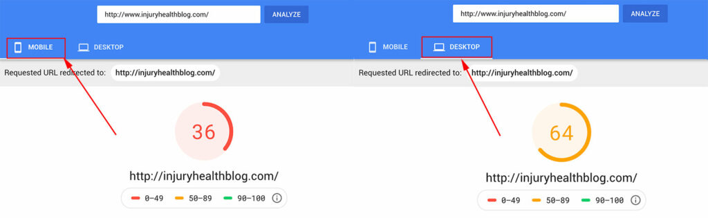
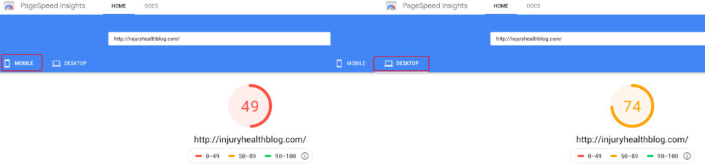
When you run a website URL through PageSpeed Insights, it’s most likely that the mobile PageSpeed scores were lower than the desktop scores. Today, I’m going to explain to you why they are different.
Why are mobile PageSpeed scores different from desktop PageSpeed scores?
Mobile PageSpeed scores are different from desktop PageSpeed scores mainly because of these factors:
- Mobile devices generally have slower processors
- PageSpeed Insights stimulates the cell network at a slower speed
- Mobile devices have device-specific CSS rules (re-sizing images, viewport size, etc.)
Let’s break down some of this information. By default, PageSpeed Insights always shows the mobile version of the site loading over a simulated 3G connection.
Without “simulated throttling” checked (Only available on Google Lighthouse audits) the mobile and desktop scores shouldn’t be much different.

Another reason mobile PageSpeed scores are different from desktop PageSpeed scores is mobile renders in different browsers with more to account for. Mobile devices also have more device-specific rules about re-sizing, etc.
This is why it’s common for mobile devices to re-size images in the browser, and why it’s so important to avoid mobile optimization errors that may slow down your site. Additionally, more CSS rules are needed for mobile devices. But generally, scores shouldn’t be too different if they both are testing on the same connection speed. Unfortunately, most of the popular speed tools test on the same connection speed.
Mobile scores usually aren’t any slower if you are tethering to wifi, but the mobile version of a site is always shown in PageSpeed Insights and Lighthouse as being loaded over a 3G connection.
Tip: If you choose to run Google Lighthouse performance audits, use an incognito/private mode browser. Private browsers run without any extensions. If you use a normal browser, those extensions can negatively affect your speed scores. Extensions will not affect PageSpeed Insights scores, so you are free to run the tests in a normal browser.
How do search engines consider mobile and desktop PageSpeed scores in terms of website ranking and SEO?
Search engines, particularly Google, consider PageSpeed as one of the many factors in their ranking algorithms. While the exact weight and impact of PageSpeed on rankings are not publicly disclosed, it is known that faster-loading websites tend to have better user experiences. Since user experience is a key consideration for search engines, they prioritize websites that offer fast loading times on both mobile and desktop devices.
Google has explicitly stated that mobile PageSpeed is a significant ranking factor for mobile searches. With the increasing number of mobile users, Google’s emphasis on mobile-friendliness and speed has become crucial. Websites that provide a seamless mobile experience with fast loading times are more likely to rank higher in mobile search results.
Are there any best practices or optimization techniques to improve PageSpeed scores on both mobile and desktop?
There are several best practices and optimization techniques to enhance PageSpeed scores on both mobile and desktop devices. Here are a few key strategies:
a. Minimize server response time: Optimize server configurations, reduce DNS lookup time, and utilize caching mechanisms to deliver quicker responses to user requests.
b. Enable browser caching: Set appropriate caching headers to instruct browsers to store static resources, such as images, CSS, and JavaScript files, locally. This reduces the need for repeated downloads and improves subsequent page loads.
c. Optimize and compress images: Resize images to the required dimensions, choose an optimal file format (e.g., JPEG for photographs, PNG for graphics), and compress images without sacrificing quality. This reduces image file sizes and improves loading times.
d. Reduce and minify code: Remove unnecessary white spaces, comments, and code redundancies. Minify CSS and JavaScript files by eliminating unused code and shortening variable names. This reduces file sizes and speeds up parsing and execution.
e. Prioritize above-the-fold content: Load critical above-the-fold content first to ensure that users see the most important parts of the page quickly. Lazy loading techniques can be used to defer the loading of non-critical resources until they are needed.
f. Optimize CSS and JavaScript delivery: Combine multiple CSS and JavaScript files into fewer files to reduce the number of requests. Use techniques like asynchronous or deferred loading to ensure that scripts do not block rendering.
g. Utilize content delivery networks (CDNs): Distribute website content across multiple servers geographically to reduce latency and improve load times for users in different locations.
h. Ensure mobile-friendly design: Adopt responsive design principles to create a single website that adapts to different screen sizes and devices. This eliminates the need for separate mobile and desktop versions and provides consistent user experiences across platforms.
Implementing these optimization techniques can significantly improve PageSpeed scores on both mobile and desktop devices, leading to better user experiences, increased engagement, and potentially higher search engine rankings.
Is there any other important information on PageSpeed Insights scores?
Google webmasters have said that the most important aspect of site speed is for publishers to make their websites perceivably fast for users. Even websites with top Google Search results struggle with speed. The average PageSpeed Insights scores across 1,000 top queries were 40 for mobile and 60 for desktop.
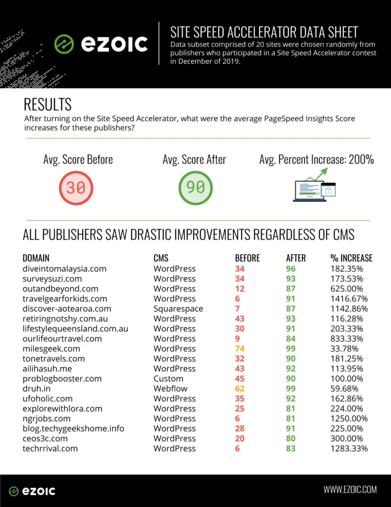
Speed is undoubtedly an issue publishers have struggled with for some time, and it doesn’t seem to be going away any time soon. That’s why Ezoic created the Site Speed Accelerator. It increases the physical speed of your website, while also solving PageSpeed Insights issues.
Below is an example of the mobile PageSpeed Insights score of a website using the Site Speed Accelerator.
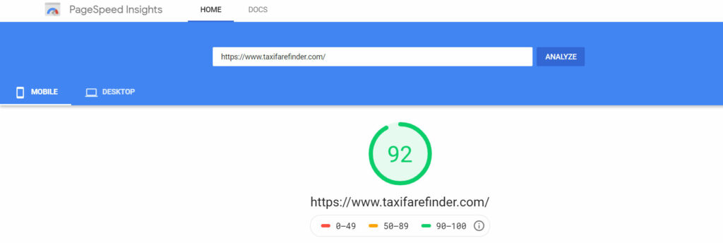
The Site Speed Accelerator will significantly increase both your mobile and desktop PageSpeed Insights scores into the 80+ range. Although most publishers see their scores much higher.
The Site Speed Accelerator Dat Sheet also shows the drastic increase in speed across websites, regardless of CMS.
How does the difference in hardware and software capabilities between mobile and desktop devices affect PageSpeed scores?
The difference in hardware and software capabilities between mobile and desktop devices can have a significant impact on PageSpeed scores. Mobile devices generally have less processing power, memory, and network bandwidth compared to desktop computers. These limitations can result in slower loading times and lower PageSpeed scores on mobile devices.
Mobile devices often have slower processors, limited RAM, and less storage capacity, which can affect how quickly a website’s resources are processed and rendered. This can lead to longer loading times, especially for websites that are not optimized for mobile devices. In contrast, desktop computers typically have more powerful processors, larger RAM capacity, and faster storage, allowing them to handle resource-intensive tasks more efficiently.
Additionally, mobile devices often rely on wireless networks, which can be less stable and have lower bandwidth compared to wired connections used by desktop computers. This difference in network connectivity can further contribute to slower loading times on mobile devices.
To address these hardware and software differences, it is important to optimize websites for mobile devices. This includes minimizing resource sizes, reducing the number of server requests, and using techniques such as lazy loading to prioritize critical content. By considering the limitations of mobile hardware and software, developers can improve PageSpeed scores and provide faster loading experiences for mobile users.
How does responsive design impact PageSpeed scores on mobile and desktop devices?
Responsive design plays a crucial role in determining PageSpeed scores on both mobile and desktop devices. Responsive design is an approach that enables websites to adapt and provide an optimal viewing experience across various screen sizes and devices. It ensures that content is displayed appropriately and effectively, regardless of the user’s device.
From a PageSpeed perspective, responsive design can positively impact the scores by eliminating the need for separate mobile and desktop versions of a website. Instead of redirecting mobile users to a separate mobile site, responsive design allows for a single website that adjusts its layout and content presentation based on the device’s screen size.
By implementing responsive design techniques, such as fluid grids, flexible images, and media queries, websites can avoid unnecessary server redirects, reduce duplicate content, and optimize resource delivery. This streamlined approach minimizes the number of resources that need to be loaded, improving PageSpeed scores for both mobile and desktop devices.
Responsive design also helps in reducing page load times by eliminating the need for additional server requests and decreasing the amount of data transferred. Users can access the same content regardless of their device, eliminating the need to download separate assets for mobile or desktop versions.
Overall, responsive design contributes to improved PageSpeed scores by creating a unified and efficient user experience across different devices, enhancing user engagement, and positively impacting SEO.
What impact do different user behaviors and expectations have on the perceived PageSpeed scores between mobile and desktop devices?
User behaviors and expectations vary between mobile and desktop devices, and this can influence the perceived PageSpeed scores.
Mobile users often have different expectations and behaviors compared to desktop users due to the context in which they use their devices. Mobile users are frequently on the go, rely on cellular networks, and have limited attention spans. As a result, they expect websites to load quickly and provide instant access to the desired information or functionality.
For mobile users, even small delays in page loading can be more noticeable and frustrating compared to desktop users. They may have less tolerance for slower loading times and are more likely to abandon a website that takes too long to load. Therefore, optimizing PageSpeed for mobile devices is crucial to meet the expectations and demands of mobile users.
Do you have any questions on why mobile PageSpeed Scores are different than desktop PageSpeed scores? Let me know in the comments.
Allen is a published author and accomplished digital marketer. The author of two separate novels, Allen is a developing marketer with a deep understanding of the online publishing landscape. Allen currently serves as Ezoic's head of content and works directly with publishers and industry partners to bring emerging news and stories to Ezoic publishers.
Featured Content
Checkout this popular and trending content

Ranking In Universal Search Results: Video Is The Secret
See how Flickify can become the ultimate SEO hack for sites missing out on rankings because of a lack of video.
Announcement

Ezoic Edge: The Fastest Way To Load Pages. Period.
Ezoic announces an industry-first edge content delivery network for websites and creators; bringing the fastest pages on the web to Ezoic publishers.
Launch

Ezoic Unveils New Enterprise Program: Empowering Creators to Scale and Succeed
Ezoic recently announced a higher level designed for publishers that have reached that ultimate stage of growth. See what it means for Ezoic users.
Announcement