
Improve Site Speed Scores By Lazy Loading Images & Serving Next-Gen Formats

Get helpful updates in your inbox
Improve Site Speed By Lazy Loading Images & Serving Next-Gen Formats
We’ve shared a few recent blogs on how to improve site speed. Last week, I covered how to optimize CSS. This week, I’ll walk you through how to configure images on your website to dramatically improve website loading times without hindering image quality.
The most common image recommendations by common pagespeed tools are:
- Properly size images (file size)
- Load images asynchronously (what’s known as “lazy loading images”)
- Avoid resizing images in the browser
- Serve images in “next-gen” formats
While some of these are really simple to accomplish, others can be quite difficult to perform across an entire site effectively. For example, resizing, compressing, and serving all of the images on your site in next-gen formats can be really time-consuming to do correctly. Additionally, most quick solutions for lazy-loading images on a website don’t take care of 3rd-party pixels and images.
Below, I’ll show some speedy hacks and solutions for optimizing all 4 points above across an entire website (step-by-step ). This way you can finally get rid of those recommendations from pagespeed tools and make your site faster (I even show how to do it without coding).
Read my blog on serving next-gen formats using WordPress here.
Can you optimize images for SEO without impacting quality?
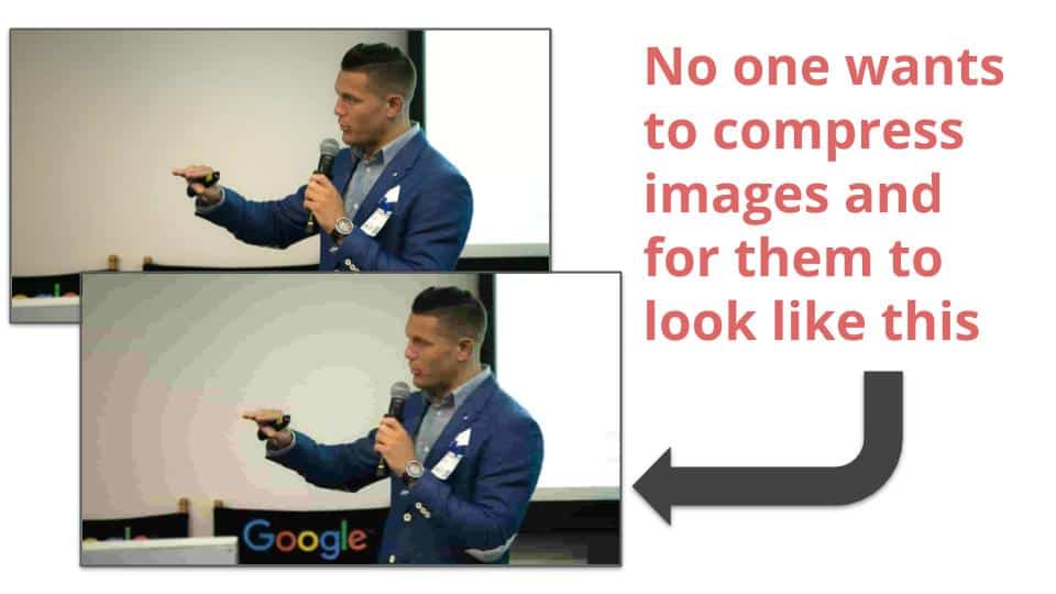
A lot of publishers and content creators I speak with are concerned about letting SEOs and webmasters optimize images because they are concerned that either compressing or changing the way that images are served will impact the quality of the image.
Essentially, the publisher or the author of the content doesn’t want visitors to see a low-resolution version of the images. That makes sense. No one wants website visitors to see a low-quality version of their site.
The truth is that next-gen image formats, lazy loading images, and even most forms of compression won’t affect image quality in any noticeable way for your visitors if you do it correctly.
 Fortunately, you can losslessly compress images, re-size them to fit different device screens, serve them in WebP formats, and have them lazy-loaded without ever impacting the visible quality of any images you might serve on a page.
These are the best practices for tuning your site to adhere to common pagespeed tools recommendations (like Google Pagespeed Insights).
If you are a photography or site specializing in images, and you want to make hi-res versions of your pictures available to be seen or downloaded, this can always be done through linking. Most images that display on the page can be served in a way that is both optimal for site speed and visually identical to the hi-res version to visitors coming to your site.
How to lazy load images to improve site speed
As I mentioned above, lazy loading images is a pretty straight forward process and there are a lot of quick solutions that will help you do this. Unfortunately, many quick-fix solutions that asynchronously load images on a page fail to identify “non-native” images. This means that they often miss 3rd party pixels and images.
What is a non-native image? A non-native image could be as simple as the Twitter logo displayed on a social sharing widget or a Facebook pixel installed in your header or footer. These are often images that are missed by common tools and plugins.
What is lazy loading images?
Lazy loading images is another term for asynchronously loading images on a web page. It is the process of having images load after the initial page request. As website visitors scroll down the page, images are loaded as they are needed by the website visitor instead of being loaded all at once when the page is requested. This makes the page load faster initially for readers and makes browsing the site a better experience.
How do you implement lazy-loading properly?
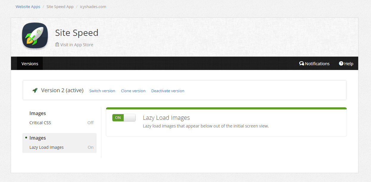
If you’re an Ezoic user, it doesn’t get much easier. You can have both native and non-native images lazy-loaded instantaneously if you use the new Site Speed app in the Ezoic app store.
The Site Speed app automatically implements lazy loading for all images according to the best practices outlined by Google. It works on every site regardless of CMS or infrastructure.
If you’re not an Ezoic user or prefer to implement it without using the Site Speed app, there are a number of options. As I mentioned before, there are a lot of really simple solutions that will allow you to implement this quickly and easily for native images only (which is still better than nothing).
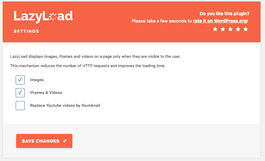
If you’re a WordPress website, you can simply download a plugin and implement it site-wide with very few conflicts for all native images. I really like the Lazy Load plugin by WP-Rocket.
This plugin — and several others out there — have very simple settings that will easily allow WordPress sites to lazy load images that they have saved as files on their site. Just be sure to use a plugin that has been tested with your version of WordPress and has a lot of active users.
If you’re using Joomla, Lazy Loading for Joomla is the CMS standard. Drupal users can use Drupal’s LazyLoader.
These plugins and extensions will take care of native images, but lazy loading non-native images is a little harder. What’s more, if you’re not using a CMS, like WordPress or Joomla, you’re still going to have to find a way to implement lazy loading for all forms of images.
Writing some simple JS can usually help you take care of the vast majority of native images or images with a <img> or <picture> tag on your website.
Example JS for lazy loading native images on custom php or any other non-WP, Joomla, or Drupal sites:
document.addEventListener("DOMContentLoaded", function() {
  var lazyloadImages = document.querySelectorAll("img.lazy");
  var lazyloadThrottleTimeout;

  function lazyload () {
    if(lazyloadThrottleTimeout) {
      clearTimeout(lazyloadThrottleTimeout);
    }

    lazyloadThrottleTimeout = setTimeout(function() {
        var scrollTop = window.pageYOffset;
        lazyloadImages.forEach(function(img) {
            if(img.offsetTop < (window.innerHeight + scrollTop)) {
              img.src = img.dataset.src;
              img.classList.remove('lazy');
            }
        });
        if(lazyloadImages.length == 0) {
          document.removeEventListener("scroll", lazyload);
          window.removeEventListener("resize", lazyload);
          window.removeEventListener("orientationChange", lazyload);
        }
    }, 20);
  }

  document.addEventListener("scroll", lazyload);
  window.addEventListener("resize", lazyload);
  window.addEventListener("orientationChange", lazyload);
});
Lazy loading the images that are hard to get… non-native images
Google’s Pagespeed Insights will always serve recommendations on non-native images — even if they are small sizes — until you are able to properly load them asynchronously. Non-native images could be from your website’s theme, pixels from social platforms, or simply images that are incorporated into various 3rd party tools or plugins used on your website.
Most plugins, extensions, and tools are not able to lazy load these images.
The process for lazy loading non-native images is the same process that many non-WordPress users will want to use to implement lazy-loading on their site.
If you want to get those hard-to-optimize non-native images — and you don’t use Ezoic — there is not an overly straightforward solution that applies to every website. Unfortunately, code bases, browser types, and a number of other factors will make some solutions easier than others for different types of sites.
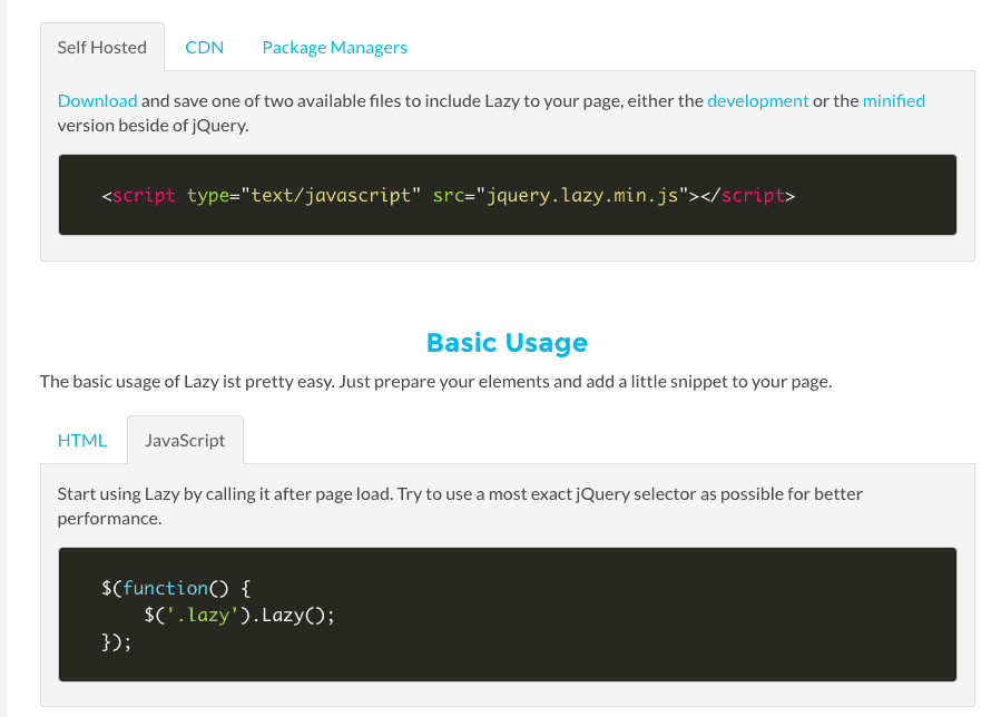
One of the most universal solutions is to implement custom lazy-loading across all images on a page using JQuery. This is a really easy-to-use and robust JQuery library that is simple to implement if you have some basic developer chops. If not, you might still be able to figure it out.
There are definitely much harder code libraries to implement and use.
Ultimately, if all you can do is lazy loading for your native images by using a plugin or extension, you’ll still have sped up your site and improved your pagespeed scores. Failing to implement it on non-native images is unlikely to slow down a website very much. It will depend on the number of 3rd party images on your particular website.
How do you compress and properly size images?
This is a topic I’ve covered in-depth before.
I discussed image compression and optimization in a previous blog post about simple SEO tricks that any webmaster can do. I recommend reading that blog to learn about re-sizing images according to Google best practices.
Here’s a quick summary of the information:
- Often publishers use images that are wider than most screen types
- Resizing images to average device pixel widths will help with file sizes
- JPEGs are typically smaller than most PNGs
- Saving images as JPEGS when there is no transparent background can help with file sizes
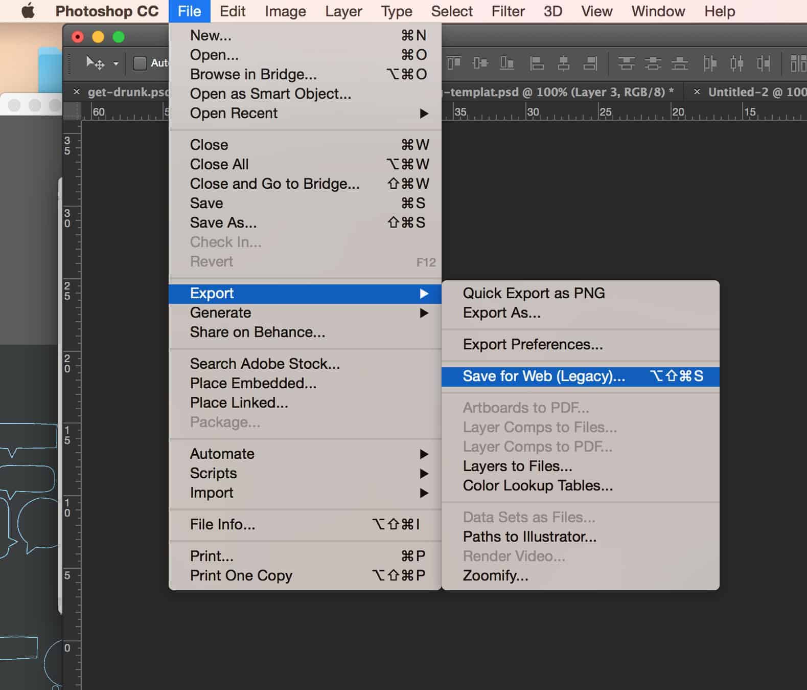
- Using Photoshop, you can save for web and compress images to your satisfaction
- You can also do this with Optimizilla — a free online compression tool
- Below, I’ll show an expedited way to do this all at once in next-gen formats
The simple rules to follow:
- Keep all images under a 99KB maximum file size
- Resize images to be less than 1000px wide
- Default to JPEG when saving images
Using this info, you can reduce image file sizes by a lot. Unfortunately, this way can become pretty manual if you’ve failed to adhere to best practices on your site previously. I recommend starting with top landing pages if you decide to go back and optimize all the images on your site.
Fortunately, there is a bit of a faster way to do some of this.
While it may not help with the physical resizing of some of the images, the process that I like for serving images in next-gen formats can actually save you a ton of manual work compressing your images.
How do you serve images in next-gen formats?
What is a next-gen image format? A next-gen image format refers to a set of file types that have improved compression and quality for web use. Popular formats include JPEG 2000, JPEG XR, and WebP. Many formats require specific browsers to load properly. This means that other image files types must be served as a default if a next-gen format is unsupported by the web visitor’s browser.
Serving these types of formats to visitors isn’t as hard as it might seem on the surface. While you will need to configure your site to properly serve these types of images, implementing these file types site-wide is actually pretty easy.
What’s more, if you don’t mind spending a very small amount of money, you can easily retrofit your entire site to serve next-gen image formats pretty quickly. The entire project might only take you an hour or two. For those who don’t want to spend money, we have an in-depth guide on how to serve images in next-gen formats using WordPress.
What’s the best next-gen image format?
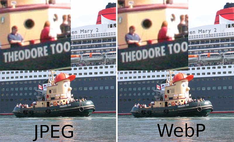
All next-gen image formats are similar in terms of compression and quality, but WebP has been the one getting the most attention recently from Google and other major platforms. Google Chrome and all the other major browsers support WebP formats in all of their most recent updates. This means it will be accessible and available to most web visitors.
WebP is also an open source format and has been garnering pretty widespread adoption across the web.
This is important because if you retrofit an entire site to serve next-generation image formats, and choose a format that eventually falls out of favor or is unsupported by some browsers, you will likely serve the default JPEG or PNG images on your site as a backup to visitors. If you haven’t manually compressed and optimized all of these, it could be a lot of wasted time and effort.
What is needed to serve WebP and other next-gen image formats?
It’s actually easier than you might think. You’ll notice it is not a regular default for most image/graphics software systems to allow users to save an image as WebP. Additionally, without the proper code on your website, uploading a WebP format image to your site could result in either an empty frame or blank space to visitors.
This is an easy fix.
You can add some simple code to your website <head> and then use a number of different converters to convert all existing images to WebP.
From there, you can easily upload WebP images to your site or use various tools to automatically convert any images you upload to your site to WebP format. Some tools will even recommend that you save files as JPEGs and store them as a backup default while allowing the converter to serve the WebP on the page unless a visitor is in an unsupported browser.
This is actually the best configuration — and the one I will show below — as it covers all your bases including image resizing, next-gen formats, and serving traditional file types to visitors in browsers that can’t view WebP images.
View blog on CSS optimization here.
How to change all images to WebP and make your website faster
There are a bunch of different approaches you could take with this. I’m going to show you the one I used for one of my WordPress blogs but it can be done inside any type of framework or CMS. You can read my guide for doing this specifically in WordPress here.
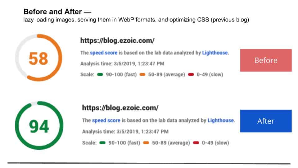
It made a moderate difference in the overall Google Pagespeed Insights score and took me less than 30-40 minutes to implement (the time for the converter to run all the images may have been slightly longer).
Although it is done using WordPress as the CMS, you’ll find that all the instructions below and tools I use are applicable across all websites; however, it may be slightly easier if you are a WordPress user (no coding).
How do I add WebP images to my website?
First, we need to make your site capable of storing, serving, and rendering WebP image formats. As I mentioned earlier, you need to have a process in place to serve back-up image files to visitors that are using browsers that don’t support the WebP format. This usually means using JS to write display rules in your site’s <head> code or modifying your .htaccess file to properly redirect image file locations base don browser details.

Option 1: There’s actually a really nice source of JS that is already Pagespeed-Insights-Optimized that is simple to add to your site. You can actually add it automatically using this simple plugin if you’re a WordPress user that wants to avoid all coding possible (keep in mind plugins work differently for all sites).
Option 2: Otherwise, you need to add these files to your database at the bottom of this page and implement the code below…
Only needed if you don’t use WordPress, or use the plugin, in Option 1:
<script>(function(){var WebP=new Image();WebP.onload=WebP.onerror=function(){
if(WebP.height!=2){var sc=document.createElement(‘script’);sc.type=’text/javascript’;sc.async=true;
var s=document.getElementsByTagName(‘script’)[0];sc.src=’js/webpjs-0.0.2.min.js’;s.parentNode.insertBefore(sc,s);}};
WebP.src=’data:image/webp;base64,UklGRjoAAABXRUJQVlA4IC4AAACyAgCdASoCAAIALmk0mk0iIiIiIgBoSygABc6WWgAA/veff/0PP8bA//LwYAAA’;})();</script>
Now, you have the ability to serve visitors WebP images and default to regular formats if they are in supported browsers. Next, you’ll need a means of converting existing images to WebP and serving newly uploaded non-next-gen images as WebP when you add new articles or posts to the site.
How do I convert images to WebP on my website?
Once you’ve written rules to serve back-up images in universally selected formats, you can use the open-source codec and download repository available here to convert images into the WebP format on your website. This will allow you to serve visitors in supported browsers WebP images straight from your existing pages.
Easier option: There are actually a lot of really great tools and plugins that simplify this process a lot and take out the need for coding. And to be honest, the tool I’m going to use below saved me a lot of time that I would have likely spent doing a fair amount of trial and error (not an endorsement).
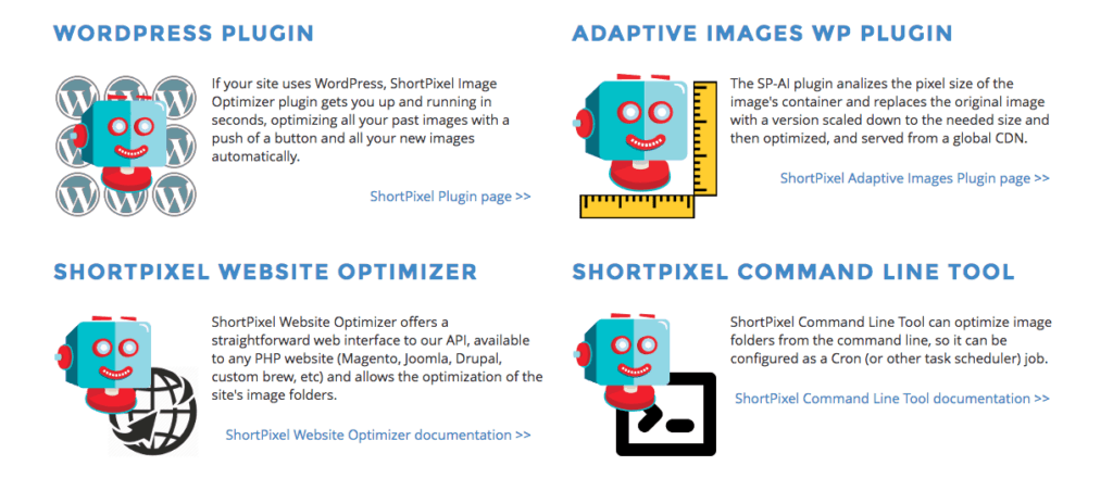
To convert existing images and automatically capture all newly upload images to WebP formats on my site, I really enjoyed using ShortPixel (non-affiliated, I just found their solution to be the best for my site).
ShortPixel does have some free features, but most publishers will likely need to opt for their credit-based image optimization plans. Since they are essentially processing and helping to store various back-ups of your images, there is a small fee associated with using their tools. However, a lot of the initial cost is upfront, and the credit system makes it pretty easy and very affordable for almost everyone.
As I mentioned above, I used the WordPress plugin and subscribed to a monthly credit plan with ShortPixel. They do have tools and resources available to convert and serve images in WebP format for other types of sites as well (Joomla, custom php, etc.) so what I show below is applicable for more than just WordPress sites. However, implementation will be slightly different.
It cost me less than $40 to convert all my site’s images. I also had enough credits left over to support my future uploads for a few months.
The steps to converting images:
1.) Once I selected the plan that fit my needs, I downloaded the plugin and entered my API key.
2.) Next, I configured ShortPixel to align with best practices on my site. See below.

3.) In the settings, there is a location where you can specify that certain file extensions, file names, and files types never be converted. This is really worth thinking about. If there are images or parts of your site that you may not want to be converted (slider backgrounds, etc.), you should consider adding them here.
NOTE: All images can be backed up in the settings and easily reverted back to their original after you convert them if it affects the way your site appears in any way.
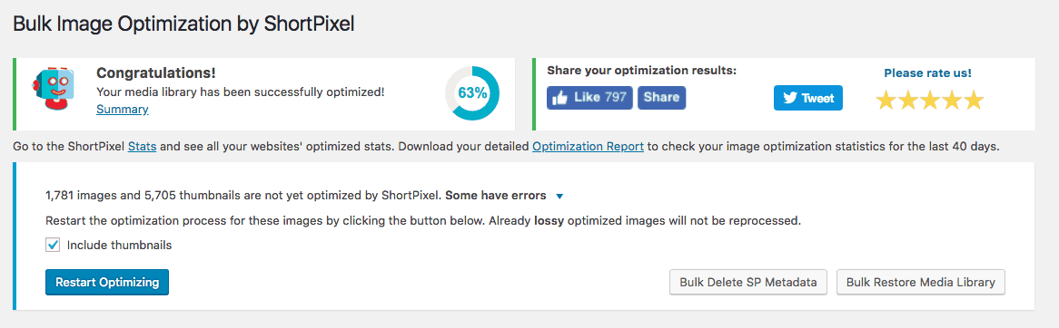
4.) Once I had the plugin configured to convert and serve next-gen images on my site according to my preferences, I was able to start bulk uploading and converting all of my site’s files.
5.) Once I finished bulk uploading images, I checked my site on multiple browsers to ensure my images were displaying correctly. Success!
After all of that, my images were compressed and optimized and I was serving supported browsers WebP images on my site.
There you go. That does it all.
In the information above, you can find pretty much all the data needed to optimize images on your website and make it much faster. At the bare minimum, it will have a better Pagespeed Insights score.
Combining this with the CSS optimization tips in our last blog will provide some impactful ways to make your website faster.
If you’re an Ezoic user, the lazy loading and CSS settings inside of the Site Speed app can make a lot of this very easy (available for free in the app store). If you’re not an Ezoic user, the plugin and rules above should provide enough simplified information to at least improve how your images are loaded on the page.
Lastly, if you want to serve next-gen image formats and improve file sizes, you can do almost all of that by following the steps in the last section above. The true best practice in doing this is manually compressing and resizing all images even before they are uploaded — that way, even when visitors are using browsers that don’t support next-gen formats they will receive a smaller file size.
If you haven’t been saving and compressing images properly, I recommend you start now no matter what. Even if you are using the optimization tools and next-gen formats above, it is smart to save all images that you upload in the most optimized size possible.
If you have any additional questions about these processes you can leave them below.
Tyler is an award-winning digital marketer, founder of Pubtelligence, CMO of Ezoic, SEO speaker, successful start-up founder, and well-known publishing industry personality.
Featured Content
Checkout this popular and trending content

Ranking In Universal Search Results: Video Is The Secret
See how Flickify can become the ultimate SEO hack for sites missing out on rankings because of a lack of video.
Announcement
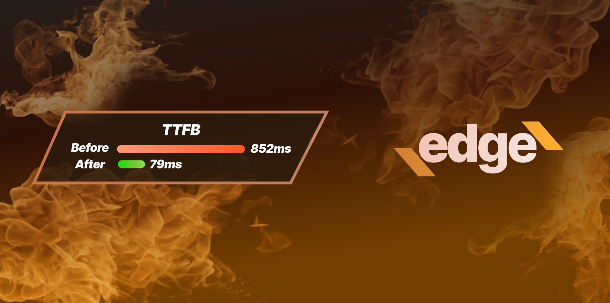
Ezoic Edge: The Fastest Way To Load Pages. Period.
Ezoic announces an industry-first edge content delivery network for websites and creators; bringing the fastest pages on the web to Ezoic publishers.
Launch

Ezoic Unveils New Enterprise Program: Empowering Creators to Scale and Succeed
Ezoic recently announced a higher level designed for publishers that have reached that ultimate stage of growth. See what it means for Ezoic users.
Announcement