
How To Fix Mobile Heading Fonts In Divi With One Easy Step

Get helpful updates in your inbox
We recently found that many sites were experiencing issues trying fixing mobile heading fonts in Divi and found the only solutions that existed were plugins. Many of these additional plugins broke other elements of Ezoic’s site.
While Divi’s adaptability as a complete design framework is easy-to-use, publishers who used different themes before Divi might find that a lot of their older blog posts don’t have the Visual Builder enabled.
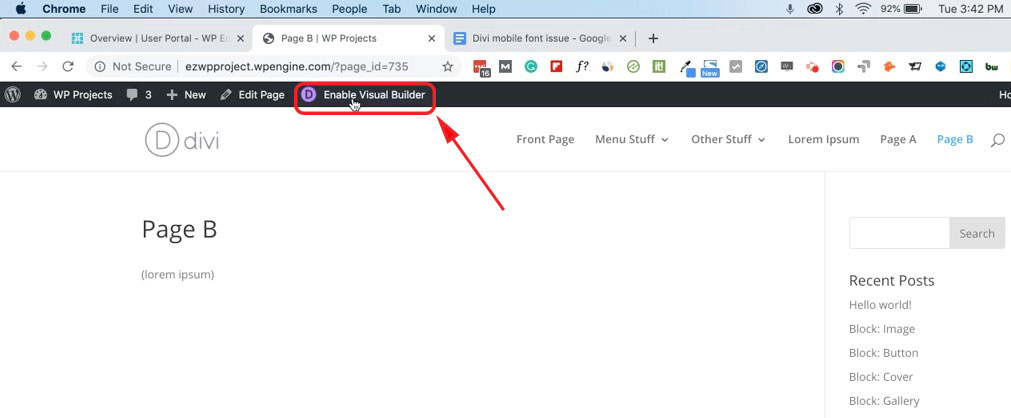 Turning on the Visual Builder post-by-post is a painstaking process. Although Divi gives you the ability to make site-wide changes, sometimes those changes break other elements of your site. If Issues do arise, they tend to appear with the mobile versions of your site—menus, headings, and fonts.
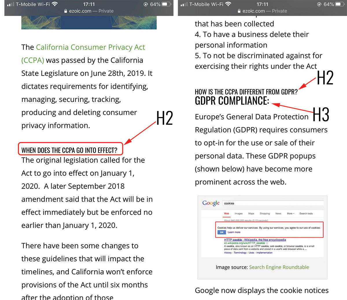
What do broken mobile heading fonts look like in Divi?
The issue we discovered was with our test was with the H2 heading fonts on mobile. They often appeared incredibly small and were being overwritten despite theme settings clearly listing the H2 headings being much larger on mobile. On posts without the Divi Builder enabled, this problem persisted.
Instead of adding the Visual Builder to every post page, writing custom code in the theme itself, or using plugins that slow down your site’s speed, we found an easy solution.
Fix mobile heading fonts in Divi with CSS custom script
To fix mobile heading fonts in Divi, copy the CSS code below:
@media screen and (max-width: 767px) {

.et_pb_post h2 {

font-size: 30px!important;

}
Next, follow these steps:
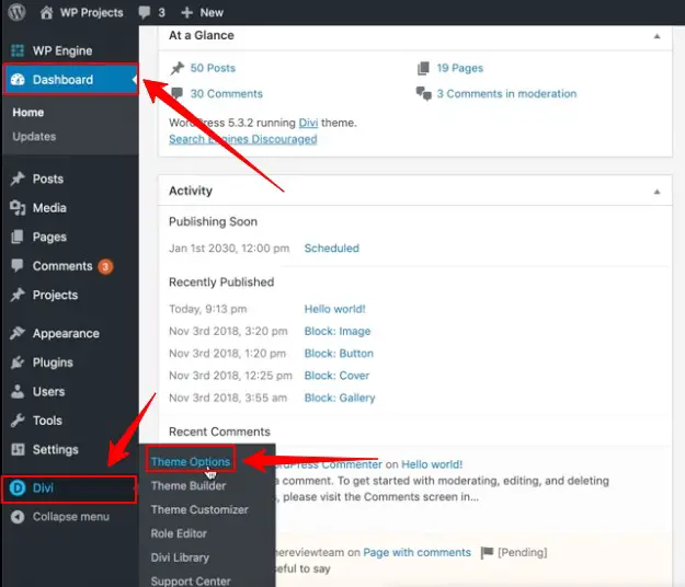
- Click on your WordPress dashboard
- Click on Divi
- Open Theme Options
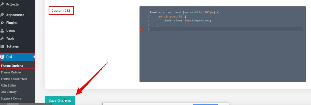
Once your theme options window has loaded, scroll down to the bottom until you find “Custom CSS”. Paste the custom CSS from above into the text window. It should look the same as the screenshot below when pasted. Then, click save changes.
And that’s it! For those who aren’t familiar with CSS, the code is setting a max-width of 767px, which should be sufficient for most mobile devices.
The headings that these changes are applied to is set to “H2”, and the font size is set to 30px. If you are trying to fix the mobile heading size of a different heading (h1,h3) or different font sizes, you can replace these specifications to fit your own needs. This CSS code should do the trick to fix mobile heading fonts in Divi site-wide. Do you have any issues with mobile fonts in Divi? Let me know in the comments.
Allen is a published author and accomplished digital marketer. The author of two separate novels, Allen is a developing marketer with a deep understanding of the online publishing landscape. Allen currently serves as Ezoic's head of content and works directly with publishers and industry partners to bring emerging news and stories to Ezoic publishers.
Featured Content
Checkout this popular and trending content

Ranking In Universal Search Results: Video Is The Secret
See how Flickify can become the ultimate SEO hack for sites missing out on rankings because of a lack of video.
Announcement
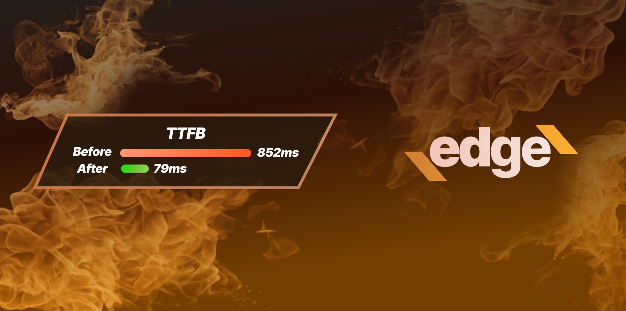
Ezoic Edge: The Fastest Way To Load Pages. Period.
Ezoic announces an industry-first edge content delivery network for websites and creators; bringing the fastest pages on the web to Ezoic publishers.
Launch
Ezoic Unveils New Enterprise Program: Empowering Creators to Scale and Succeed
Ezoic recently announced a higher level designed for publishers that have reached that ultimate stage of growth. See what it means for Ezoic users.
Announcement