

How To Keep Columns Side-By-Side On Mobile in Divi

The [Divi Builder](https://www.elegantthemes.com/gallery/divi/) gives users a complete design framework that is easy-to-use. Although sometimes, optimization errors exist between desktop and mobile versions of pages on the site. We recently discovered that it’s difficult to keep columns side-by-side on mobile. Instead, they appear stacked.
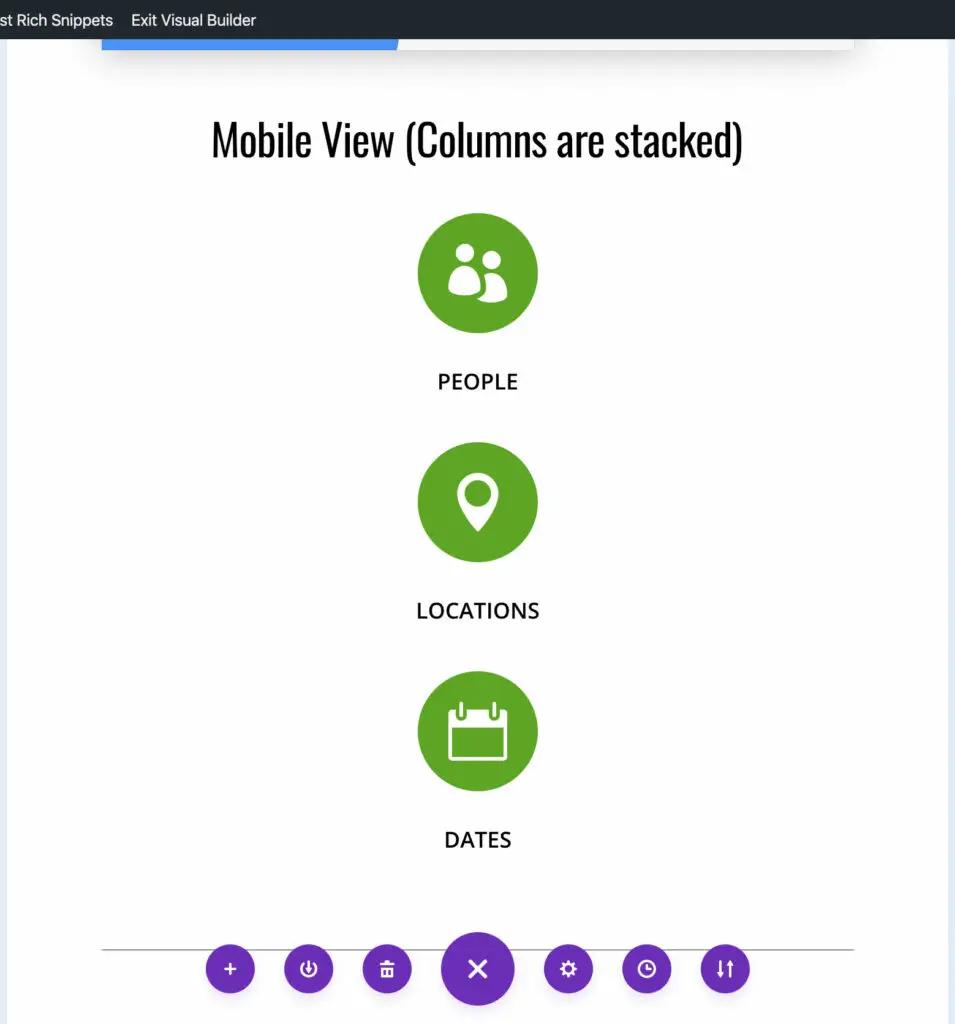
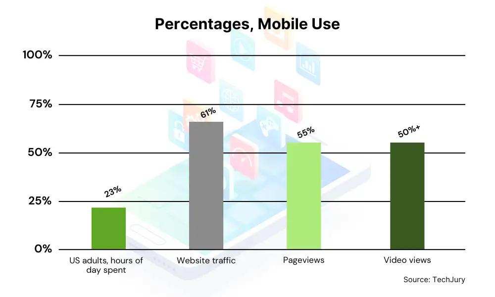
Having your mobile site optimized is essential nowadays, as it is the primary shareholder of online traffic, and [that percentage is only increasing](https://techjury.net/blog/mobile-vs-desktop-usage/).
- US adults spend 5.5 hours daily on their mobile phones
- Mobile phones generate 60.66% of website traffic
- 55% of pageviews come from mobile phones
- More than half of all video views come from mobile devices
How To Keep Columns Side-By-Side On Mobile in Divi
To keep columns side-by-side on mobile in Divi, all you have to do is add a custom line of CSS code to your row settings.
**Important: This code only works for 3 or fewer elements.** If you are trying to have four or more columns side-by-side on mobile, [jump to that section now](#section1).
Here is the code: `display: flex;`
Step 1: Open the row settings
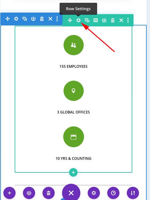
Open the row settings for the row that’s housing your “stacked” columns.
Step 2: Add the custom CSS to the row
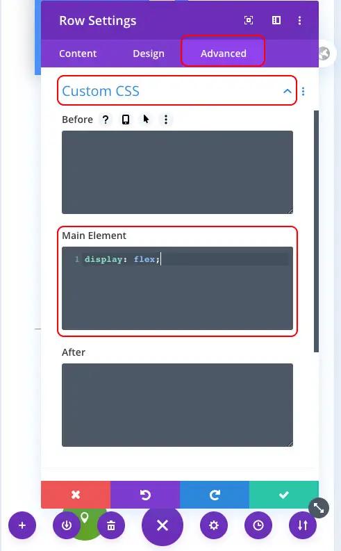
Click the “advanced” tab on the row settings. Click on the “Custom CSS” drop-down to open it. Add the `display: flex;` code to the “main element” section of your custom CSS.
When you click the green checkmark to save your changes, you’ll see the updated mobile view instantly if you’re building on the front end.
And that’s it! This piece of CSS code is by far the easiest way to make 2-3 elements appear side-by-side on mobile and tablet devices.
How to keep 4 or more columns side-by-side on mobile in Divi
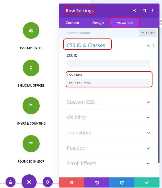
Go to your row settings of the row that has 4+ “stacked” columns. In the “advanced” tab, open the CSS ID & Classes drop-down tab.
In the “CSS Class” section of your row settings, name the class with however many columns you desire. **For example**: `four-columns`
Next, go into the Divi > Theme options. You can also use the “customize” section of your theme to edit on the front end as well.
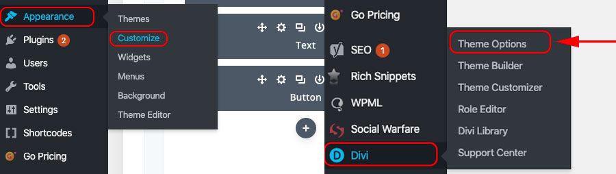
Once in Divi > Theme options, scroll down to the ‘Custom CSS” section.
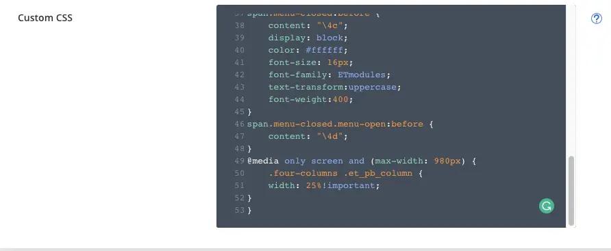
This is the CSS code for 4 screens:
`@media only screen and (max-width: 980px) { .four-columns .et_pb_column { width: 25%!important; } }`
What is this code doing? The @media only screen and (max-width: 980px) is dictating that when the viewport is less than 980 pixels, to display the 4 columns side-by-side and not stacked. 980 pixels is the dimension that typically is the breakpoint for tablets.
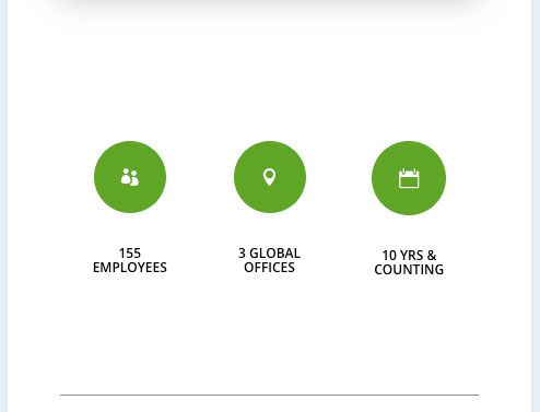
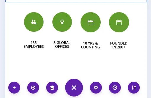
The correct end result looks like this:
How do you keep 5 Divi columns side-by-side on mobile?
If you have more than 4, 5, or 6 icons/images or more, you can repeat use the same code as above.
**Remember: You** **must change the “width” percentage section for every new column you add.**
For example: 5 columns
`@media only screen and (max-width: 980px) { **.five-columns** .et_pb_column { width: **20%**!important; } }`
You must divide the number of columns by 100. So 6 columns / 100 = 16.66%. You have to follow this pattern for however many columns you’re trying to have side-by-side. Don’t forget to create a new “CSS Class” in your advanced row settings in Divi. If it were four-columns before, you could change it to five-columns, six-columns, etc. Make sure you update the bolded sections of the code above as well in the custom CSS in your theme options in Divi.
Wrapping up how to keep columns side-by-side on mobile in Divi
If you have 3 or fewer columns to keep side-by-side, the `display:flex;` code in the custom CSS section of your row settings is the easiest way to get the desired result. Additionally, we have another Divi tutorial blog on [how to fix mobile heading fonts](/?p=48735).
Do you have any questions about this tutorial? Let me know in the comments.
How To Keep Columns Side-By-Side On Mobile in Divi
To keep columns side-by-side on mobile in Divi, all you have to do is add a custom line of CSS code to your row settings.
**Important: This code only works for 3 or fewer elements.** If you are trying to have four or more columns side-by-side on mobile, [jump to that section now](#section1).
Here is the code: `display: flex;`
Step 1: Open the row settings
Open the row settings for the row that’s housing your “stacked” columns.
Step 2: Add the custom CSS to the row
Click the “advanced” tab on the row settings. Click on the “Custom CSS” drop-down to open it. Add the `display: flex;` code to the “main element” section of your custom CSS.
When you click the green checkmark to save your changes, you’ll see the updated mobile view instantly if you’re building on the front end.
And that’s it! This piece of CSS code is by far the easiest way to make 2-3 elements appear side-by-side on mobile and tablet devices.
How to keep 4 or more columns side-by-side on mobile in Divi
Go to your row settings of the row that has 4+ “stacked” columns. In the “advanced” tab, open the CSS ID & Classes drop-down tab.
In the “CSS Class” section of your row settings, name the class with however many columns you desire. **For example**: `four-columns`
Next, go into the Divi > Theme options. You can also use the “customize” section of your theme to edit on the front end as well.
Once in Divi > Theme options, scroll down to the ‘Custom CSS” section.
This is the CSS code for 4 screens:
`@media only screen and (max-width: 980px) { .four-columns .et_pb_column { width: 25%!important; } }`
What is this code doing? The @media only screen and (max-width: 980px) is dictating that when the viewport is less than 980 pixels, to display the 4 columns side-by-side and not stacked. 980 pixels is the dimension that typically is the breakpoint for tablets.
The correct end result looks like this:
How do you keep 5 Divi columns side-by-side on mobile?
If you have more than 4, 5, or 6 icons/images or more, you can repeat use the same code as above.
**Remember: You** **must change the “width” percentage section for every new column you add.**
For example: 5 columns
`@media only screen and (max-width: 980px) { **.five-columns** .et_pb_column { width: **20%**!important; } }`
You must divide the number of columns by 100. So 6 columns / 100 = 16.66%. You have to follow this pattern for however many columns you’re trying to have side-by-side. Don’t forget to create a new “CSS Class” in your advanced row settings in Divi. If it were four-columns before, you could change it to five-columns, six-columns, etc. Make sure you update the bolded sections of the code above as well in the custom CSS in your theme options in Divi.
Wrapping up how to keep columns side-by-side on mobile in Divi
If you have 3 or fewer columns to keep side-by-side, the `display:flex;` code in the custom CSS section of your row settings is the easiest way to get the desired result. Additionally, we have another Divi tutorial blog on [how to fix mobile heading fonts](/?p=48735).
Do you have any questions about this tutorial? Let me know in the comments.